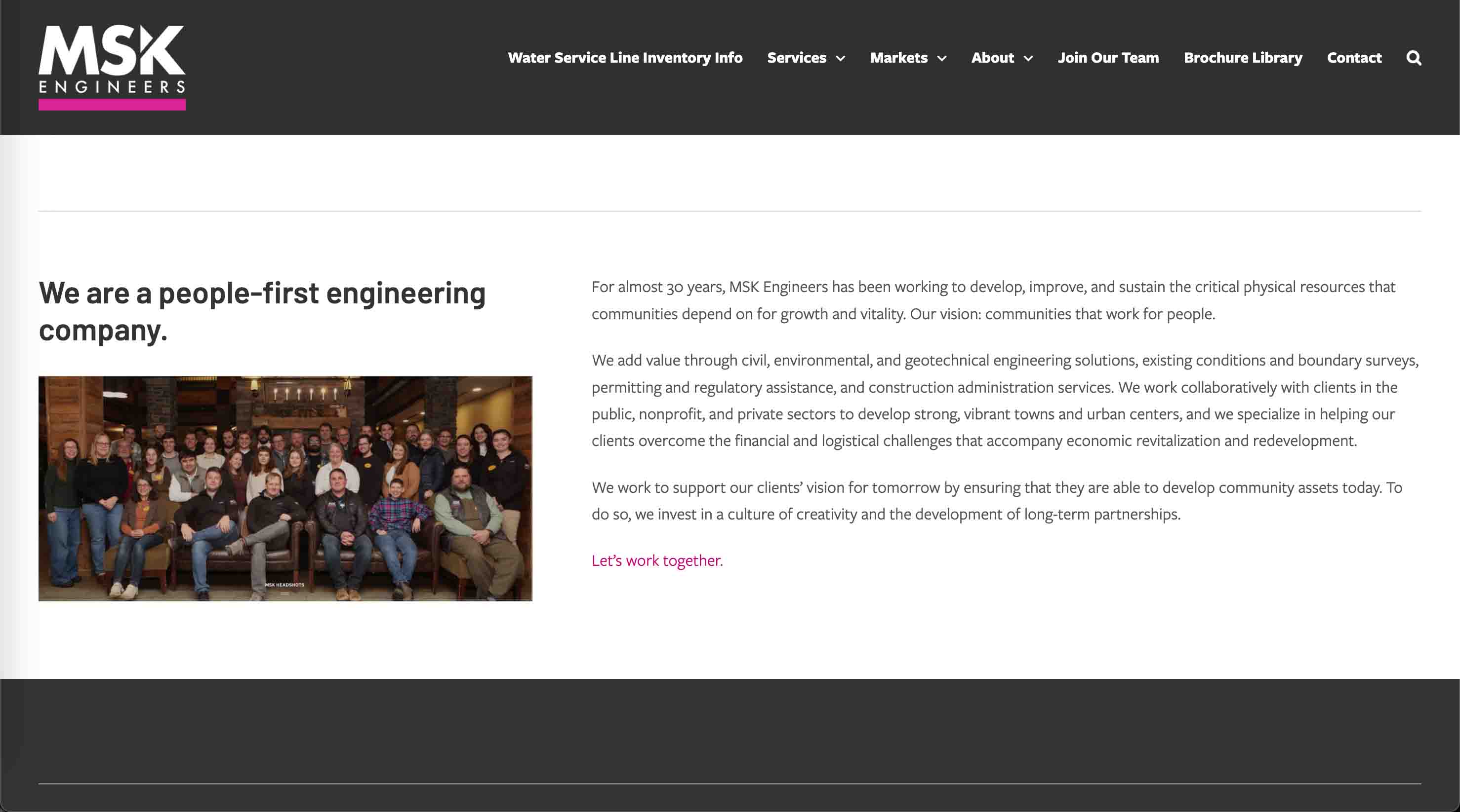
MSK Engineers
I worked as a technician, graphic designer, and marketing assistant for MSK Engineers, a civil and environmental engineering firm based in Bennington, Vermont. I created marketing materials, redesigned their website, produced data visualizations, and led UX improvements that improved their digital presence.
Most of my work with MSK was for their Water Service Line Inventory project. MSK served as a consultant to the state of Vermont to assist in the completion of comprehensive water service line inventories in over 100 water systems in the state of Vermont. The purpose of this project was to identify and remediate lead and galvanized iron service lines in water systems across the state.
This lead project created a significant need for marketing materials to help homeowners understand the project and to communicate the scope to the public.
Service line illustration + homeowner UX
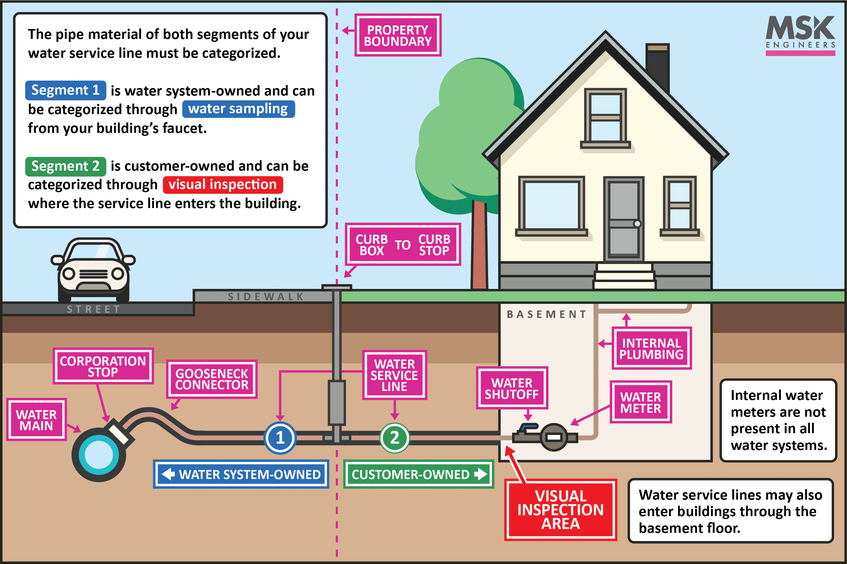
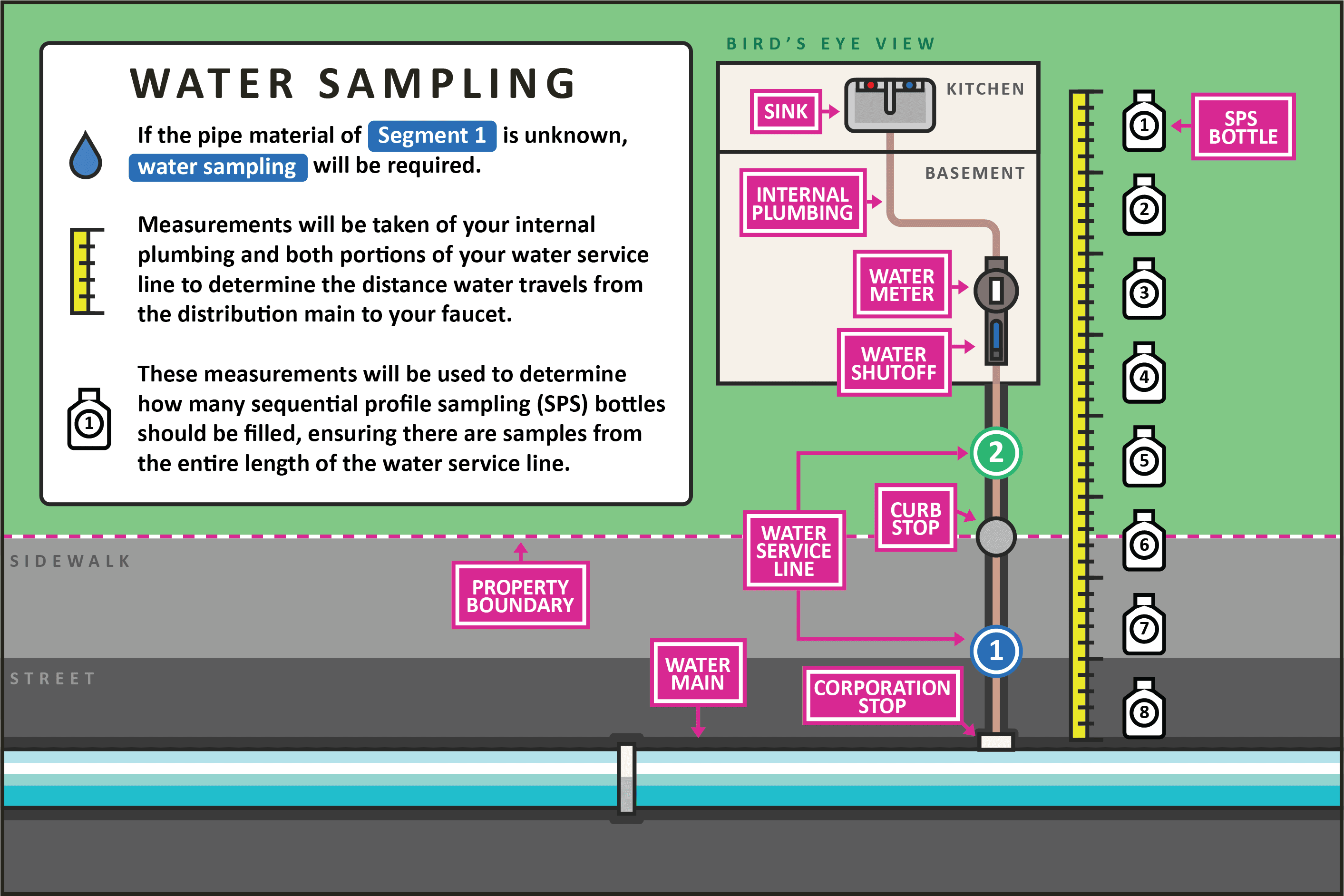
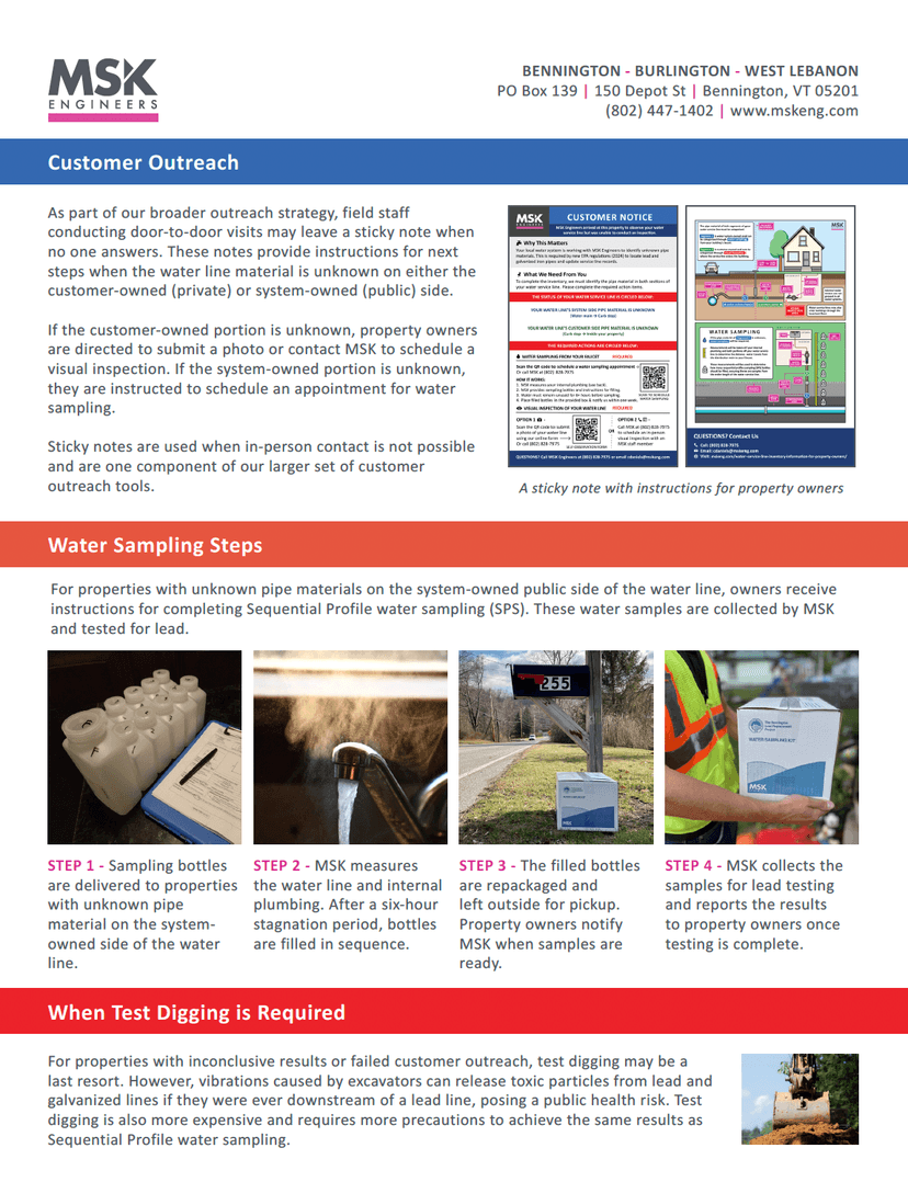
To help homeowners understand water service lines, I drew a custom illustration that shows public versus private ownership and above- and below-ground components. We chose a style that fits MSK's brand and included only the parts we needed. The illustration appears on the website and on a door-to-door sticky note used during outreach. I also designed the sticky note's UX and layout to guide homeowners through the identification steps.
How This graphic was made
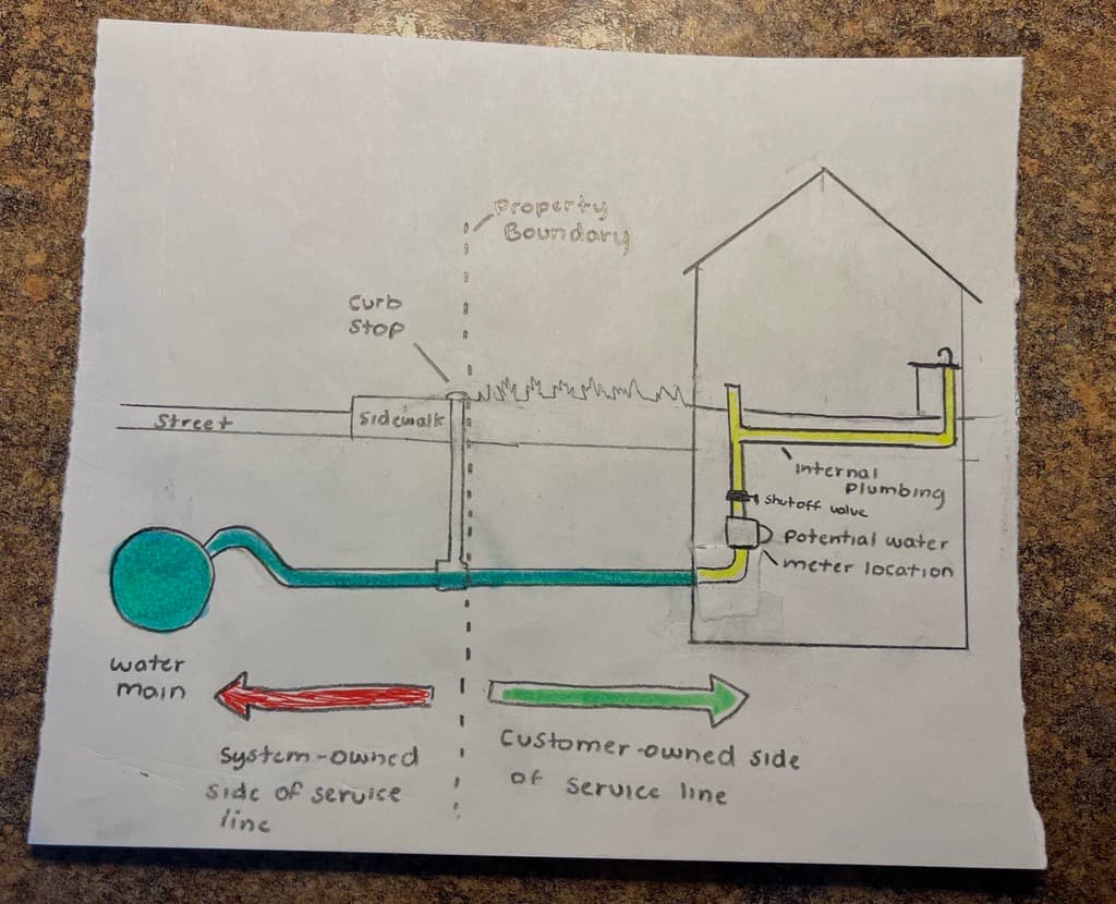
My coworker sketched an initial diagram for me to build the illustration from, inspired by ideas from previous service line illustrations we found online.
Many of these preexisting online diagrams handled the visual differently. We wanted to make our own custom illustration that included every part of the water service line that we needed, with clear labels and MSK's brand identity. We prioritized parts of the service line that are most important to homeowners so they could understand their line and give us accurate information.
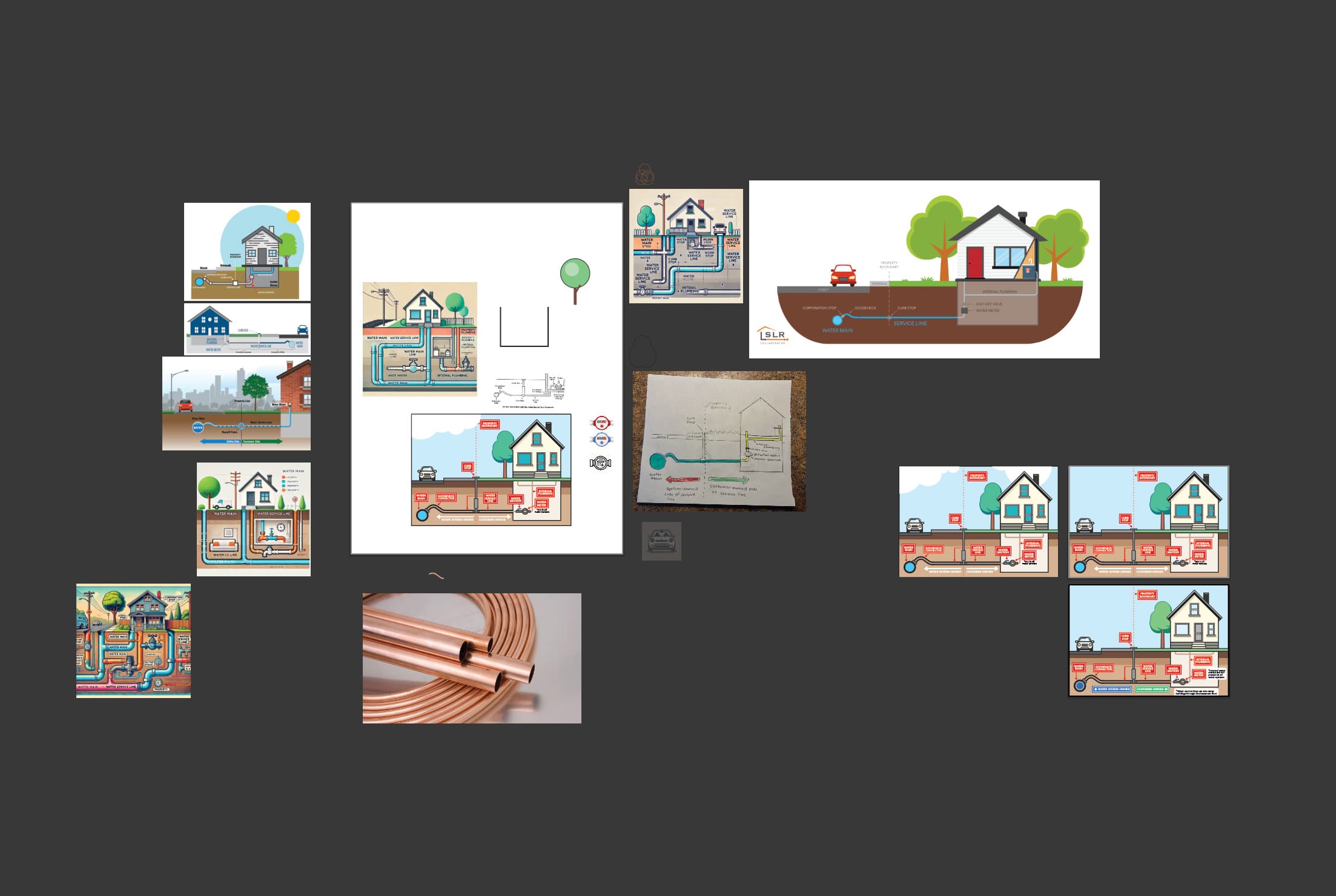
Then I moved into Adobe Illustrator to draft the graphic.
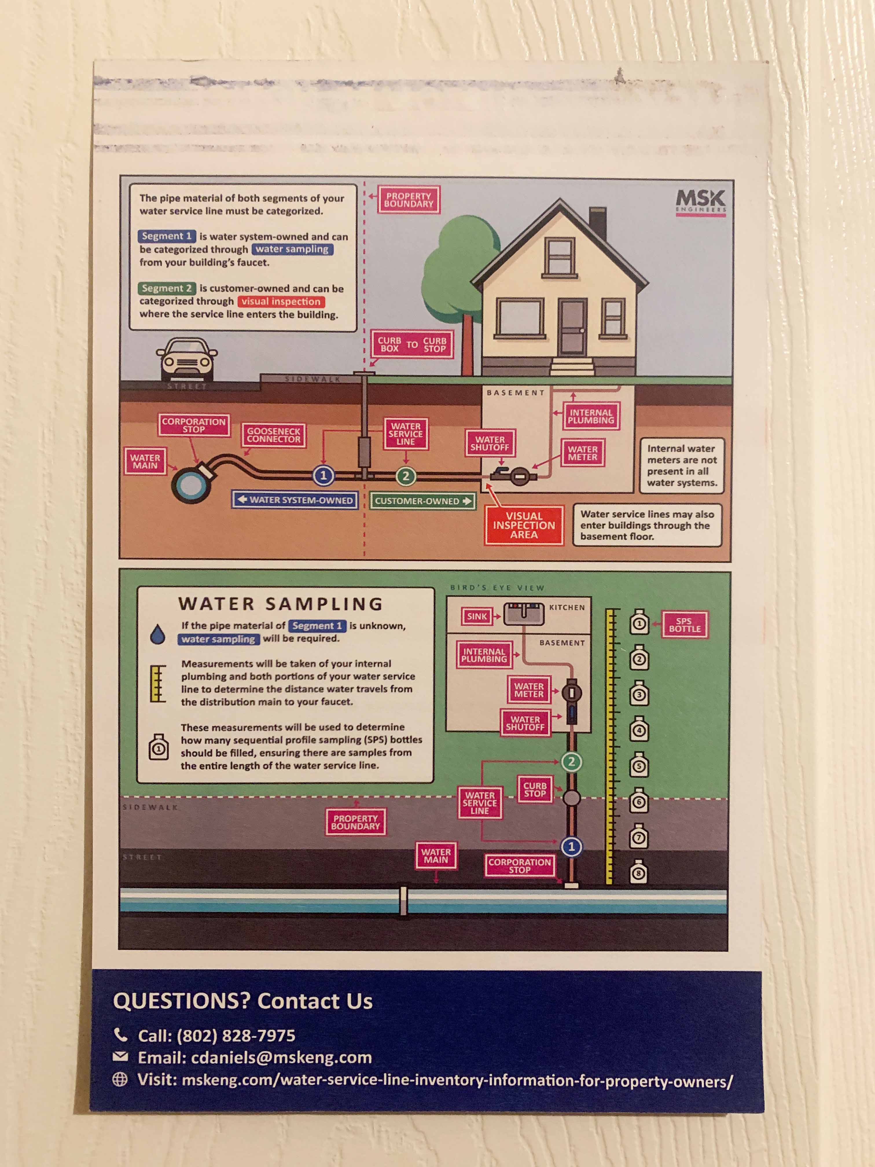
I also designed a sticky note technicians could leave on homeowners' doors to introduce the project. I coordinated the UX so the form was easy for residents to complete and practical for crews in the field. The service line diagram on the back helped people recognize the parts of their water service line.
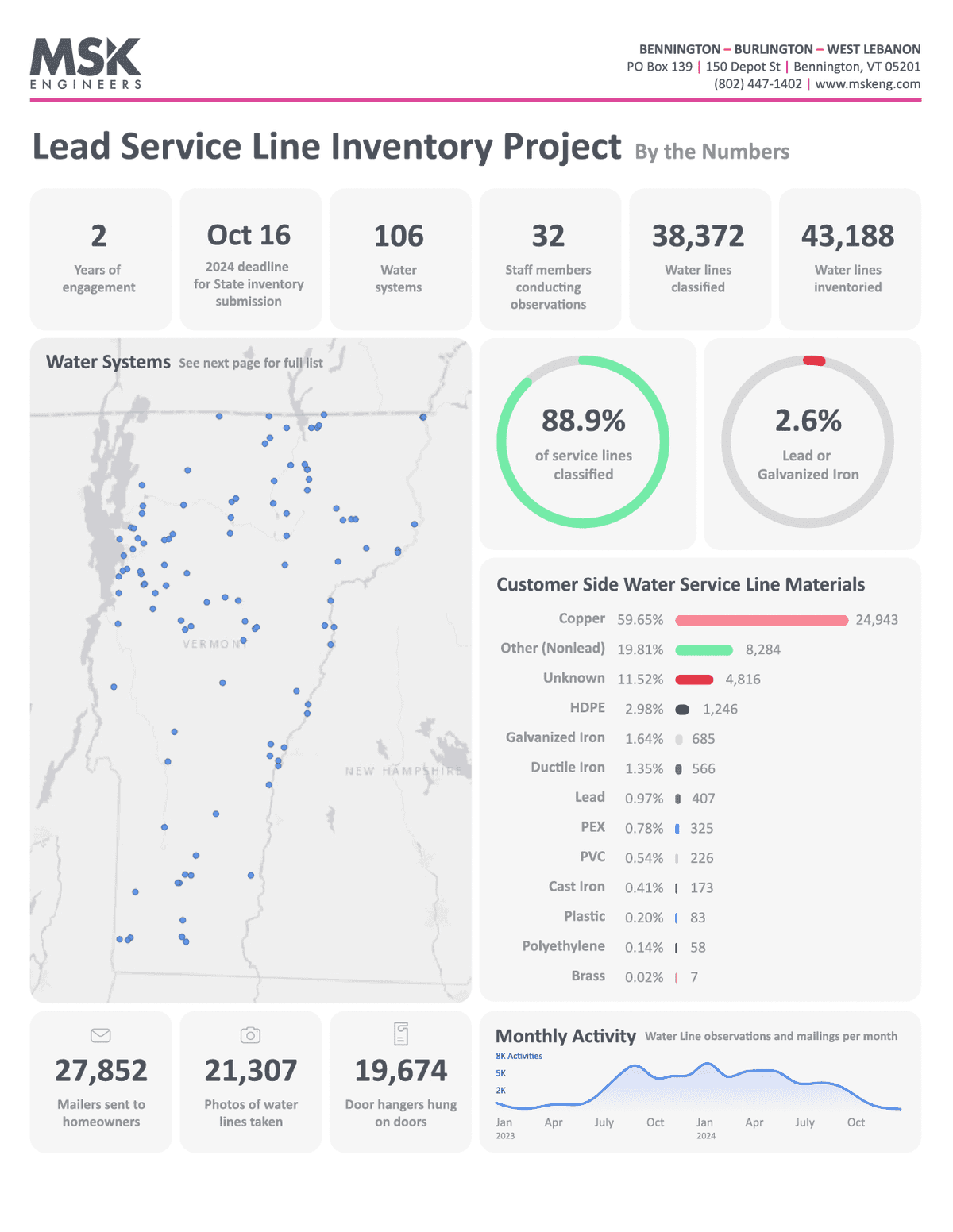
Lead service line stats one sheeter + ACEC poster
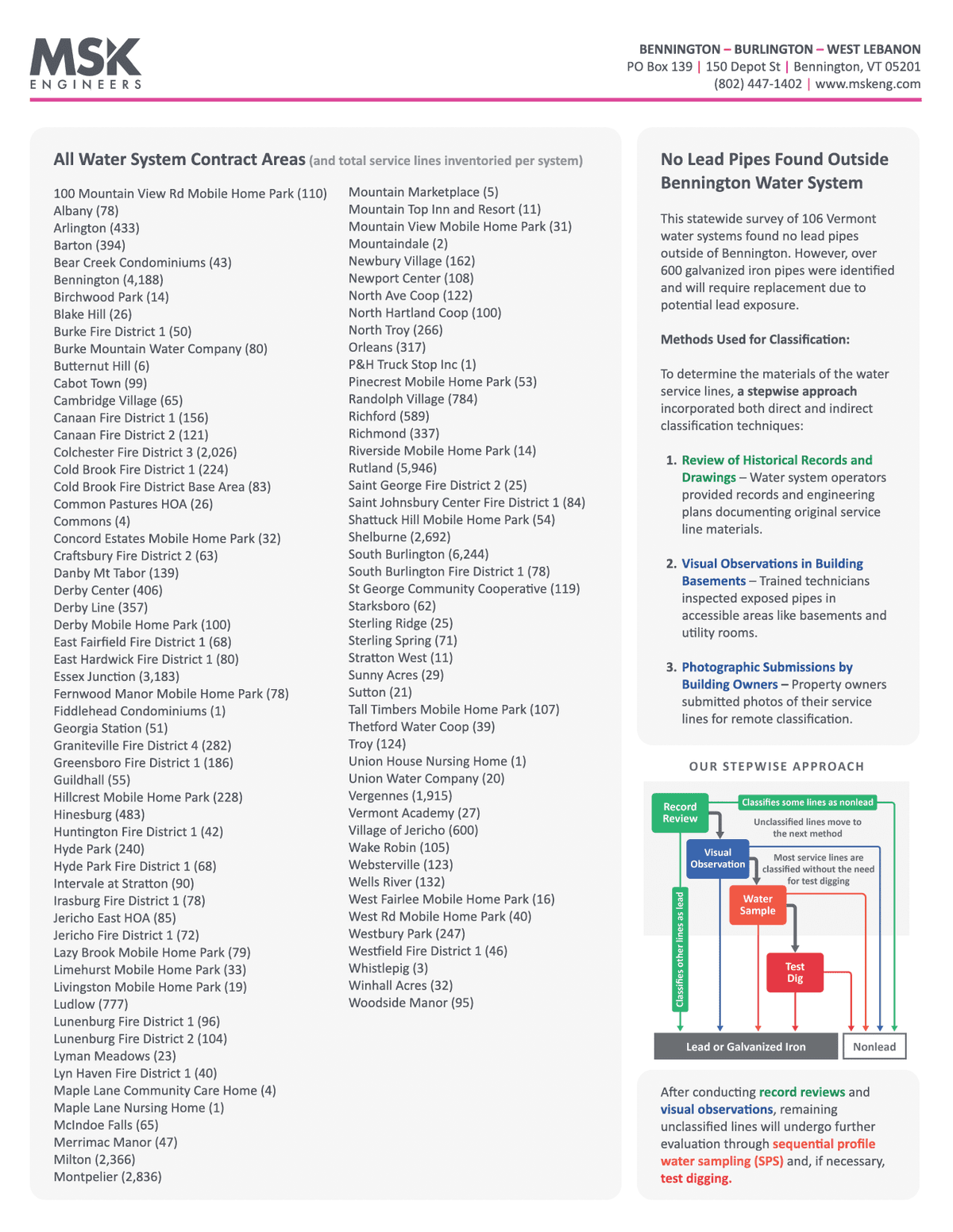
The service line inventory project created a ton of data to work with. All field activities were recorded in our database, including values like pipe materials, technician notes, outreach methods, and observation outcomes. Each water system's inventory was tracked in its own state-approved Excel spreadsheet, and I wanted to create a graphic that summarized all of this raw data into insights that could fit onto one sheet of paper, front and back.
This involved processing all of the Excel spreadsheets and analyzing the data in Python. The data included more than 30,000 properties and 70,000 field activities. Using Adobe Illustrator, Photoshop, InDesign, and Figma, I created a final graphic that summarizes the scope of MSK's work.
Front
Back
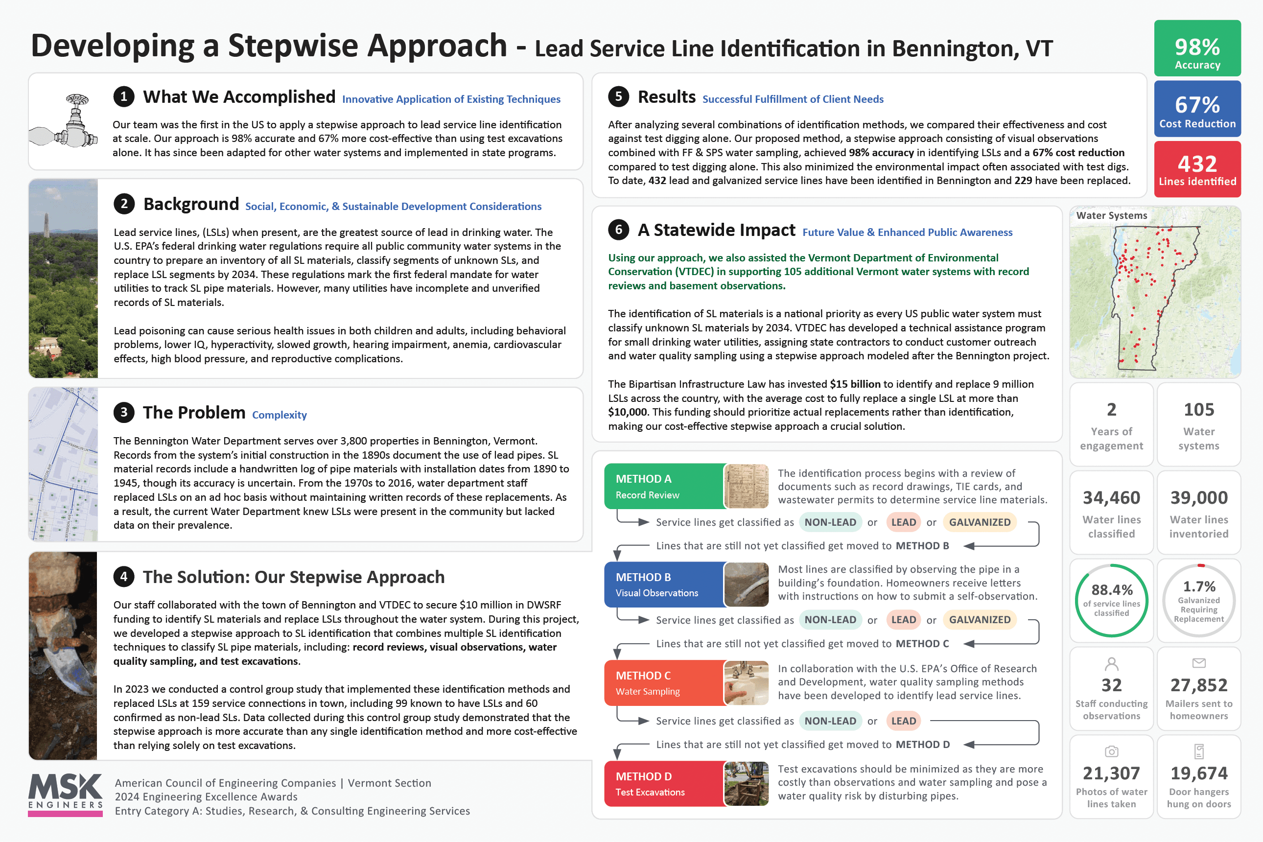
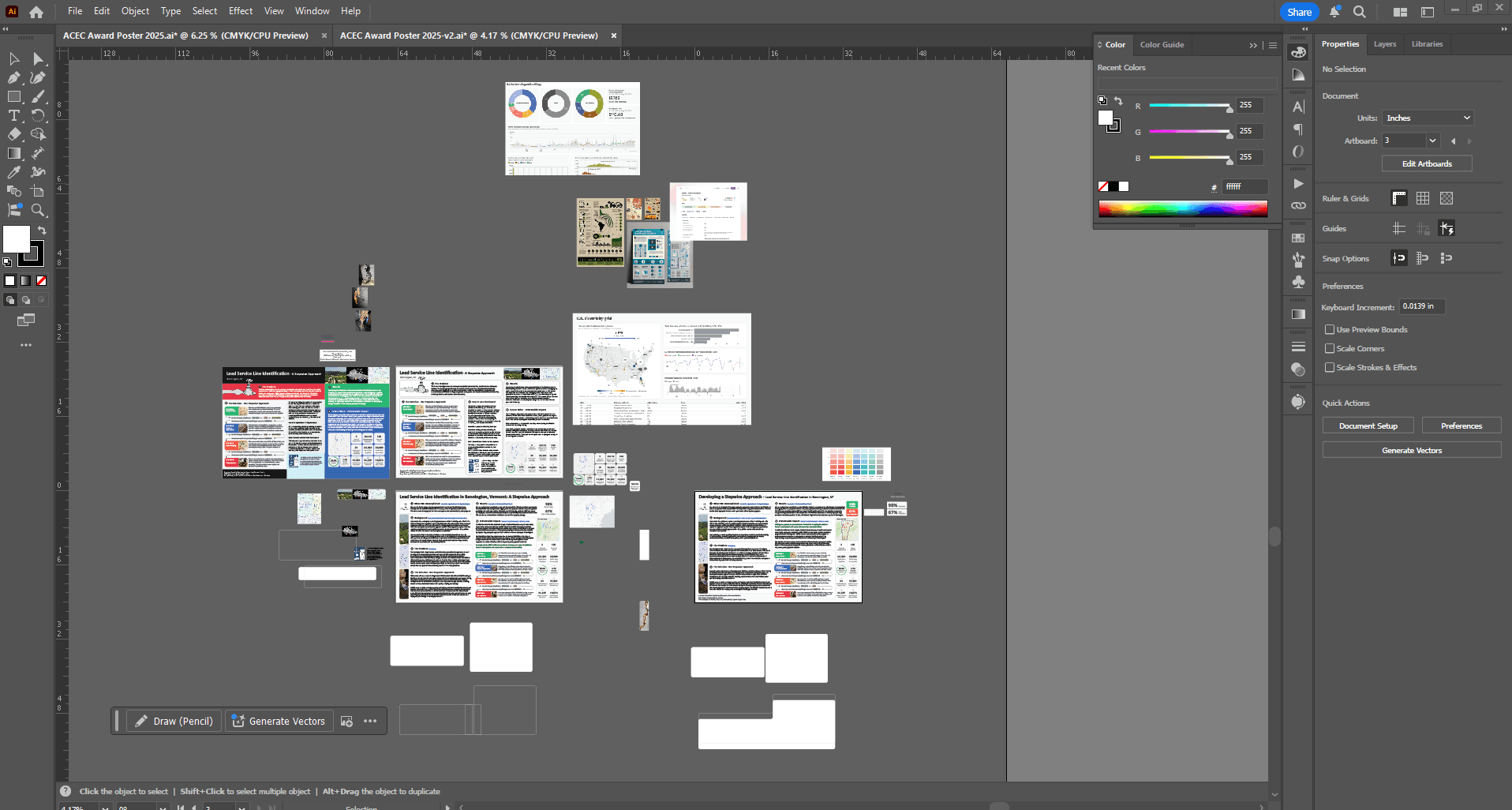
ACEC POSTER
This graphic was later adapted to a poster format for submission to the American Council of Engineering Companies (ACEC) for the “2024 Engineering Excellence Award Submission.” MSK won the award for this entry.
The poster used a larger layout so we could outline the whole project with more room for narrative. This included the goal, background, problem, solution, results, and the future of the project. I gathered this content from our civil and environmental engineers and translated it into the larger visual format.
How this graphic was made
Each water system maintained its own state-approved Excel spreadsheet, submitted to the state with service line material, size, replacement need, and other inventory fields.
Within each spreadsheet, every address in that water system was listed with pipe material, classification source, replacement status, and other technician notes.
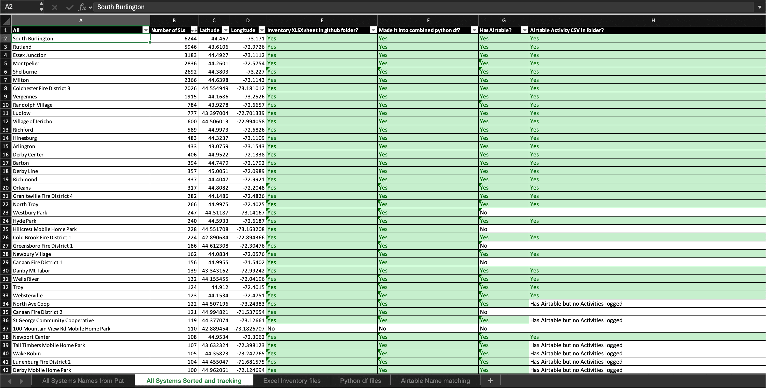
I compiled all 106 of these spreadsheets into one place and began processing them in Python.
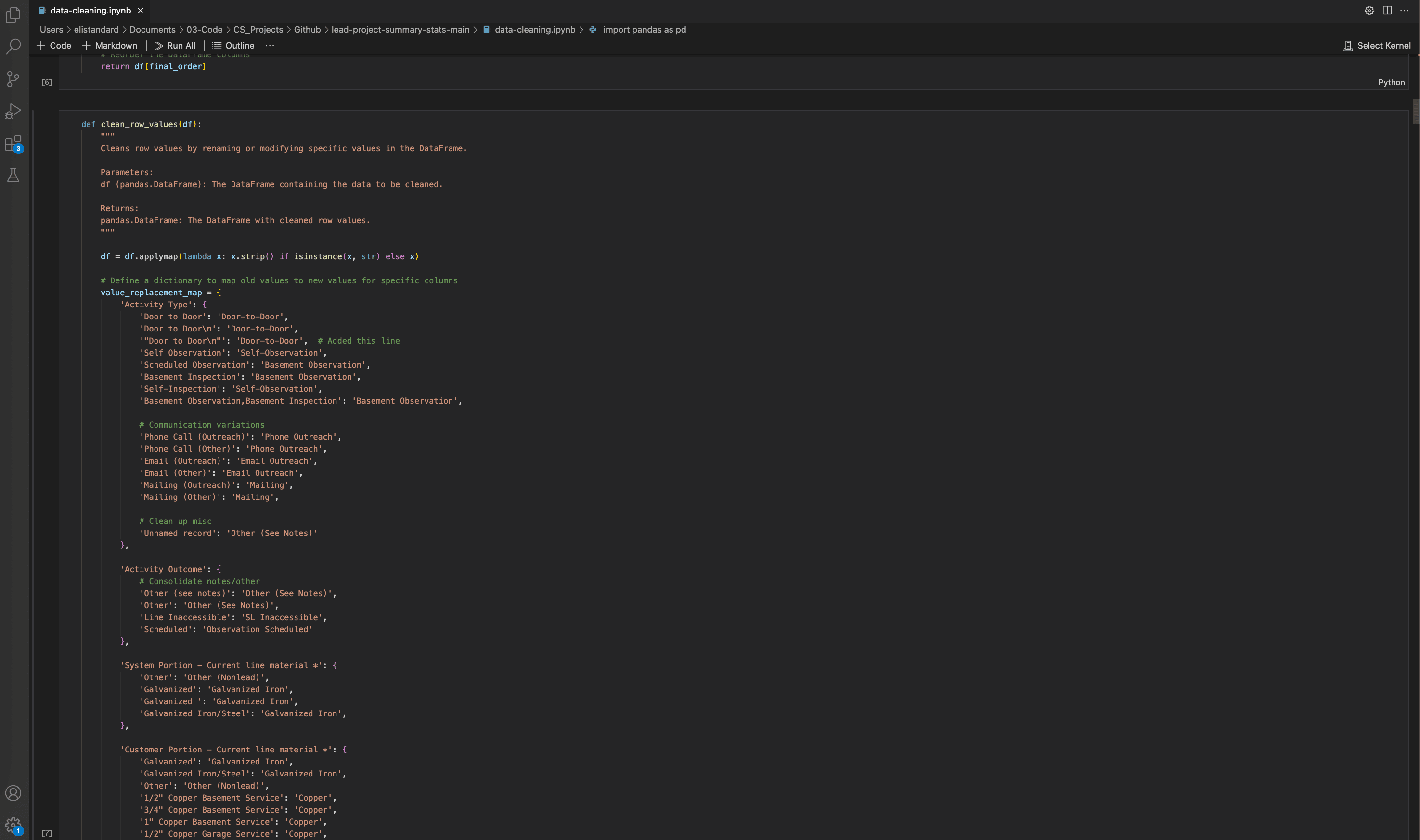
I cleaned the row data from all of the spreadsheets, ensuring consistency in wording by correcting subtle differences in spelling, phrasing, and coded values as the project evolved over several years.
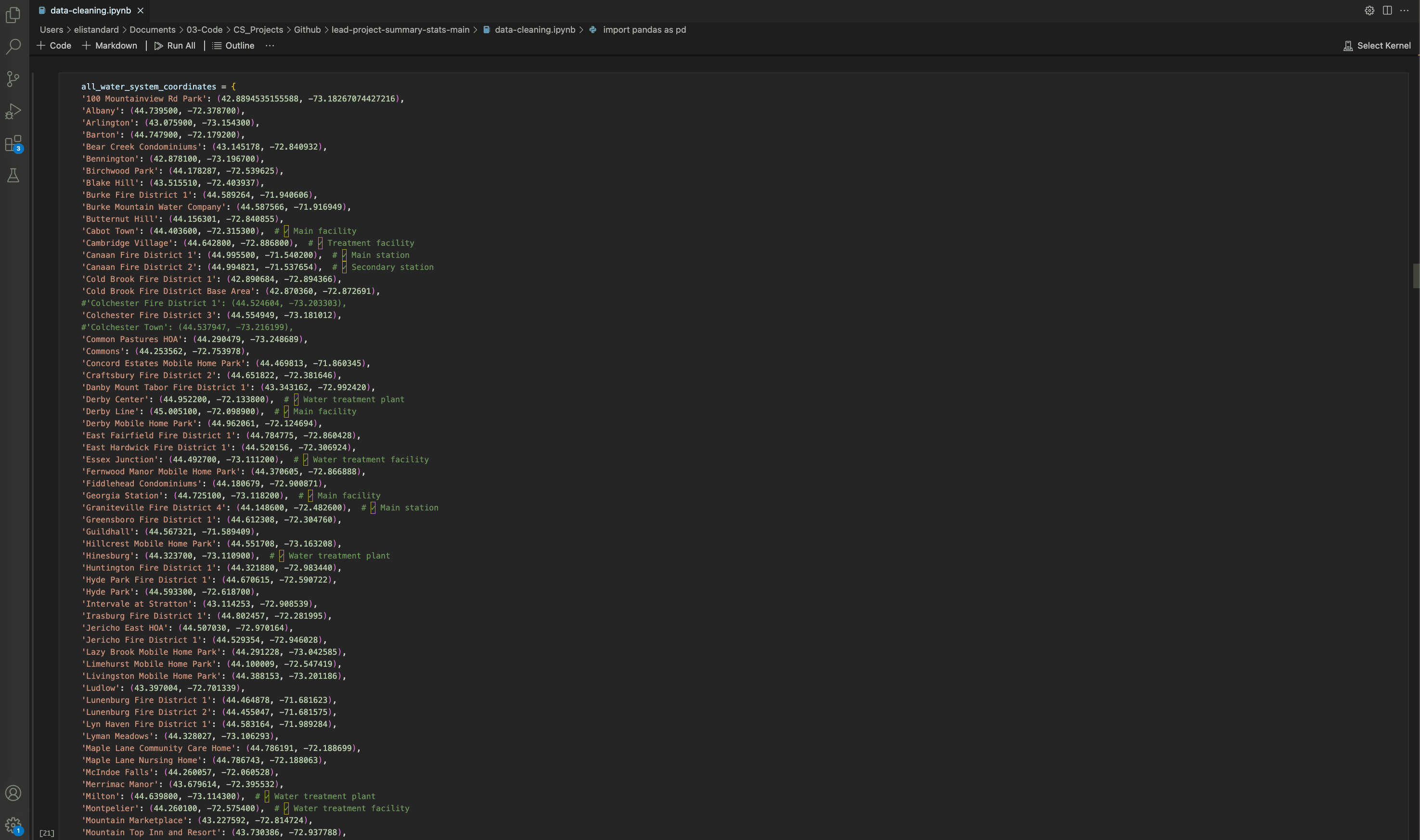
I also gathered coordinates for each water system so their location could be plotted on a GIS map.
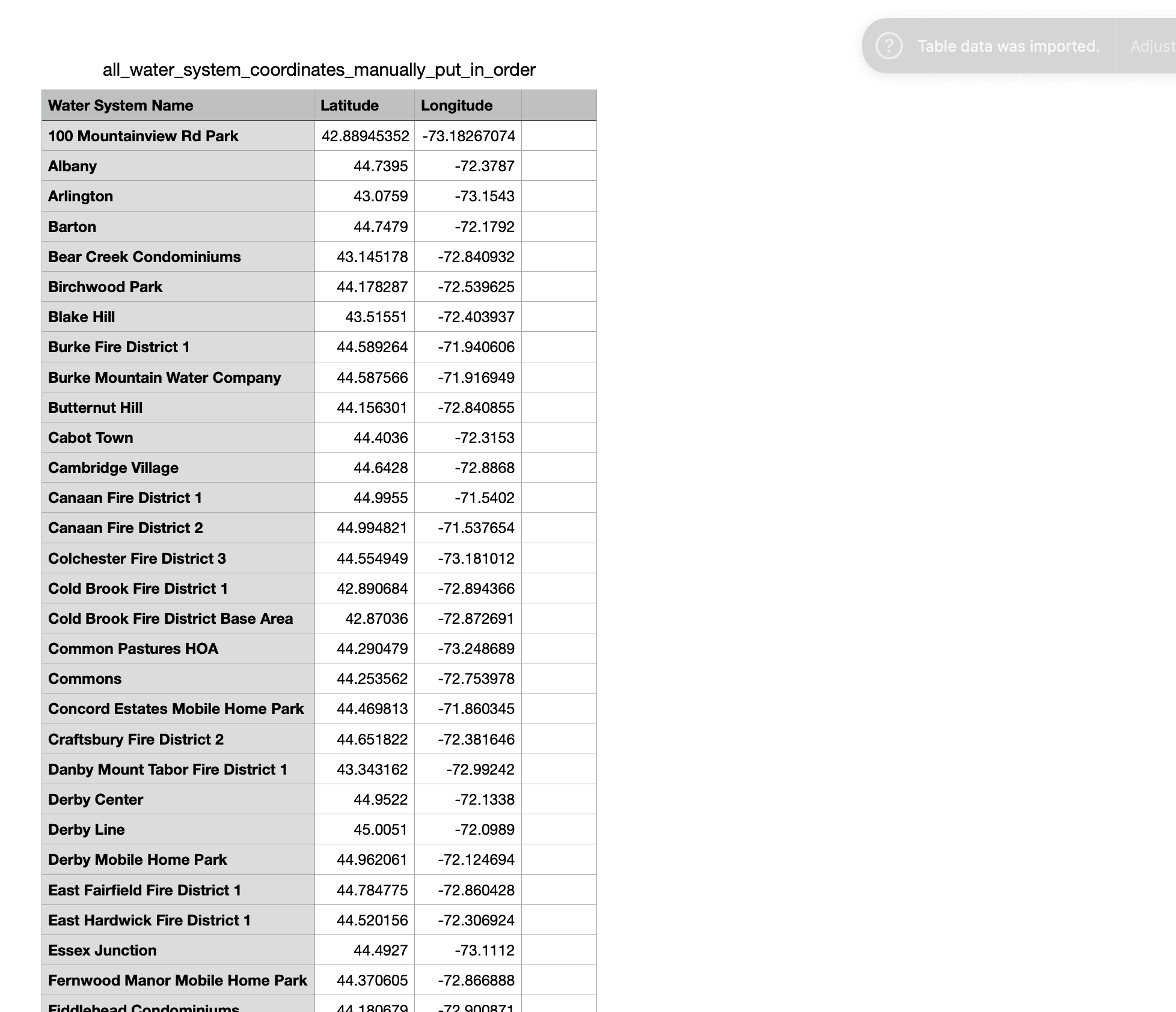
I converted those coordinates into a dataframe for analysis and plotting.
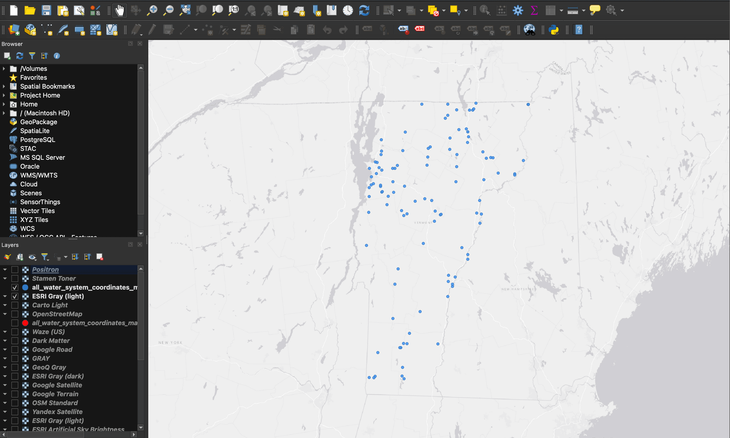
I plotted the systems in QGIS to be used in the informational one-sheeter and the ACEC poster.
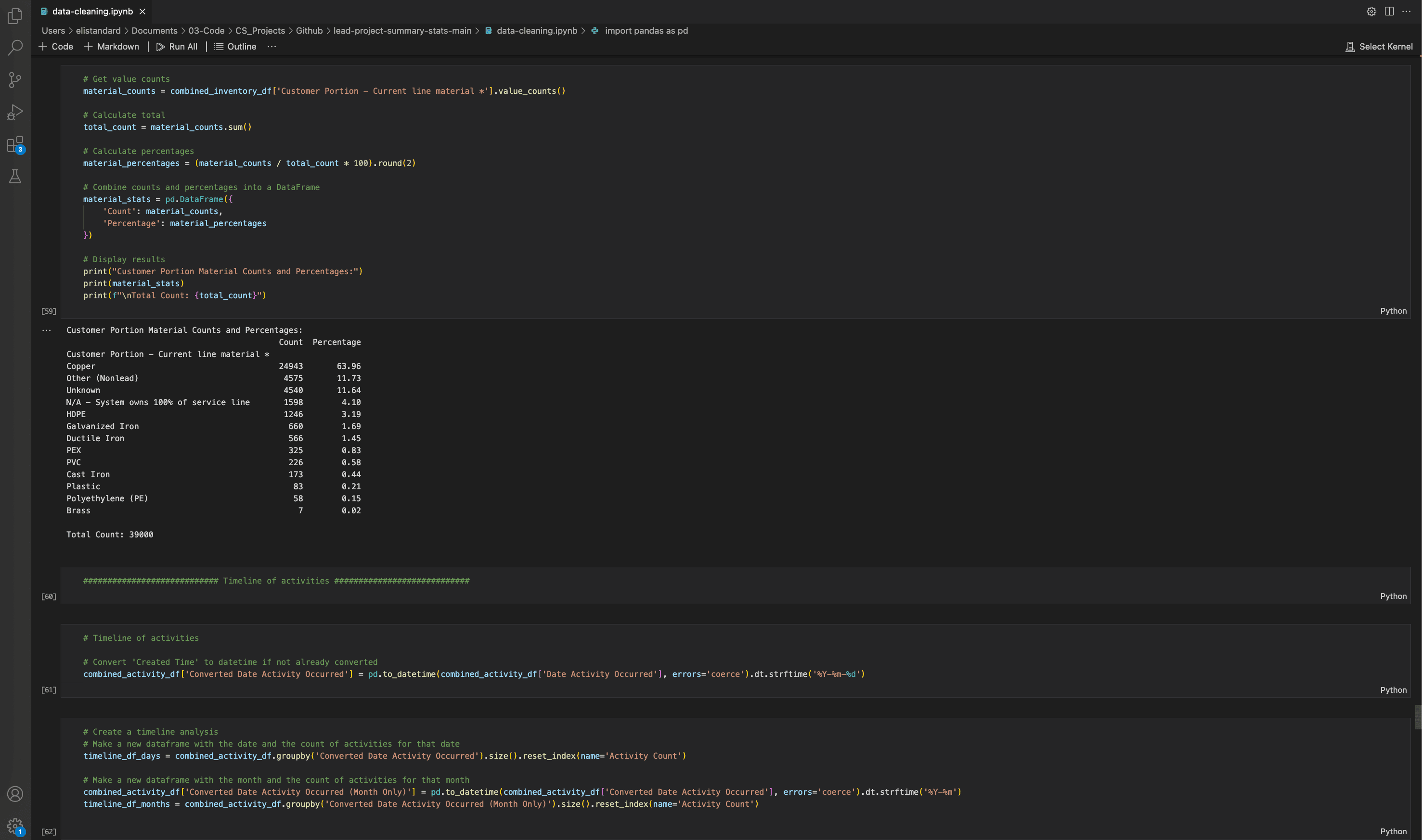
I summarized tens of thousands of service line values so the final counts and percentages could be displayed for the one-sheeter.
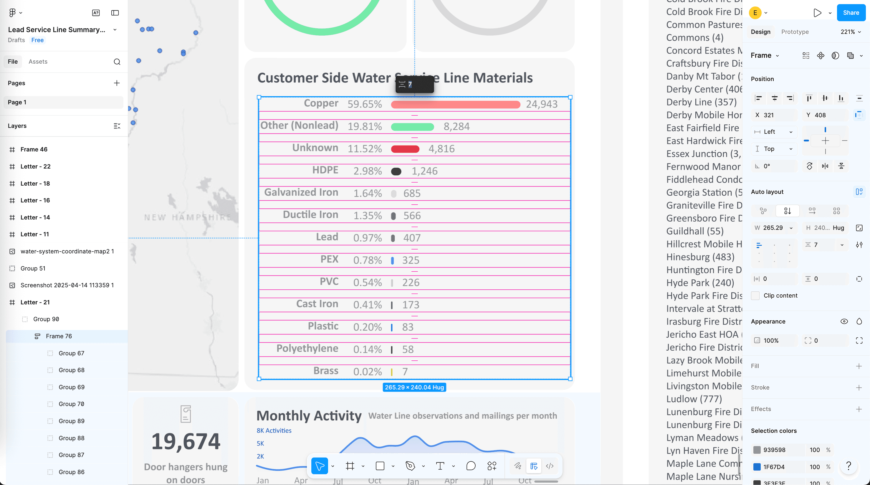
I turned those counts and percentages into manually-traced visuals in Figma, including bar charts, pie charts, and line graphs.
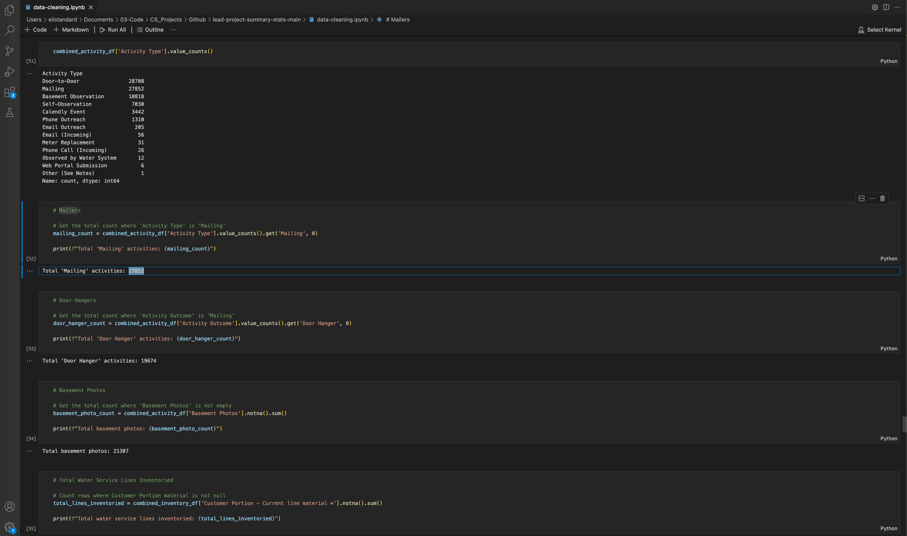
To create comprehensive activity summaries, I processed all of our Airtable activity records, including door-to-door visits, mailings, basements observed, homeowner self-reports, calendar events, and other outreach methods.
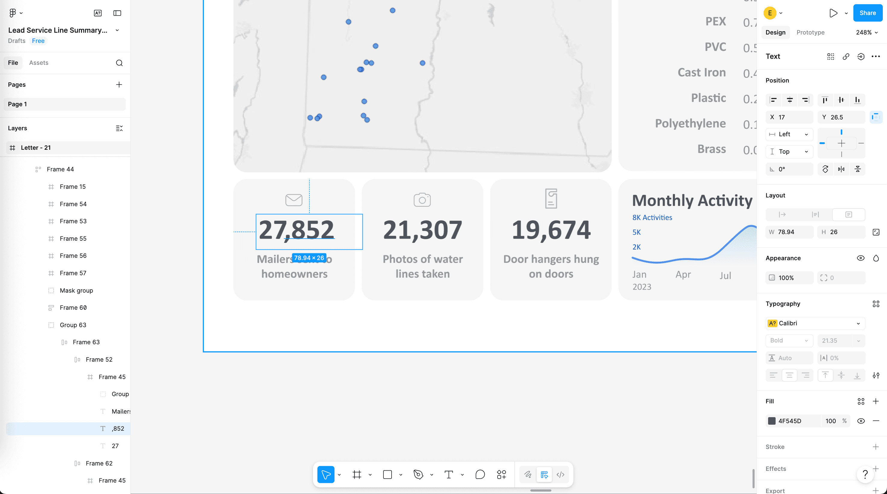
I put these summaries into the layout in Figma, creating visuals on the grid with icons and captions. These included key field activity metrics like mailers sent to homeowners, photos of water lines taken, and informational door hangers hung on doors.
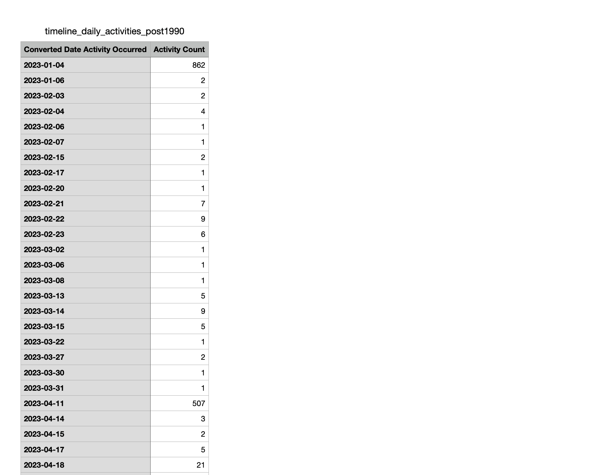
I also wanted to make a timeline of how these field activities changed over time during the roughly two-year project. I started by calculating how many activities occurred on each active project day from Airtable.
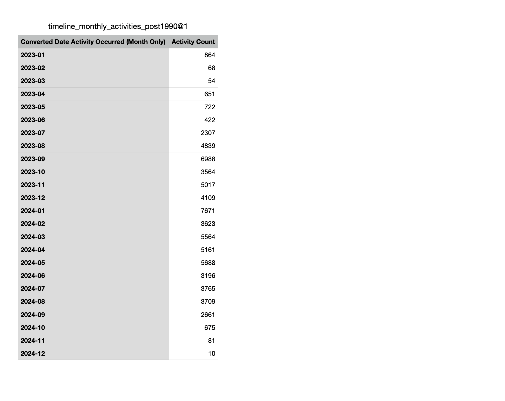
Next I rolled those daily totals into monthly buckets to smooth the series for charting.
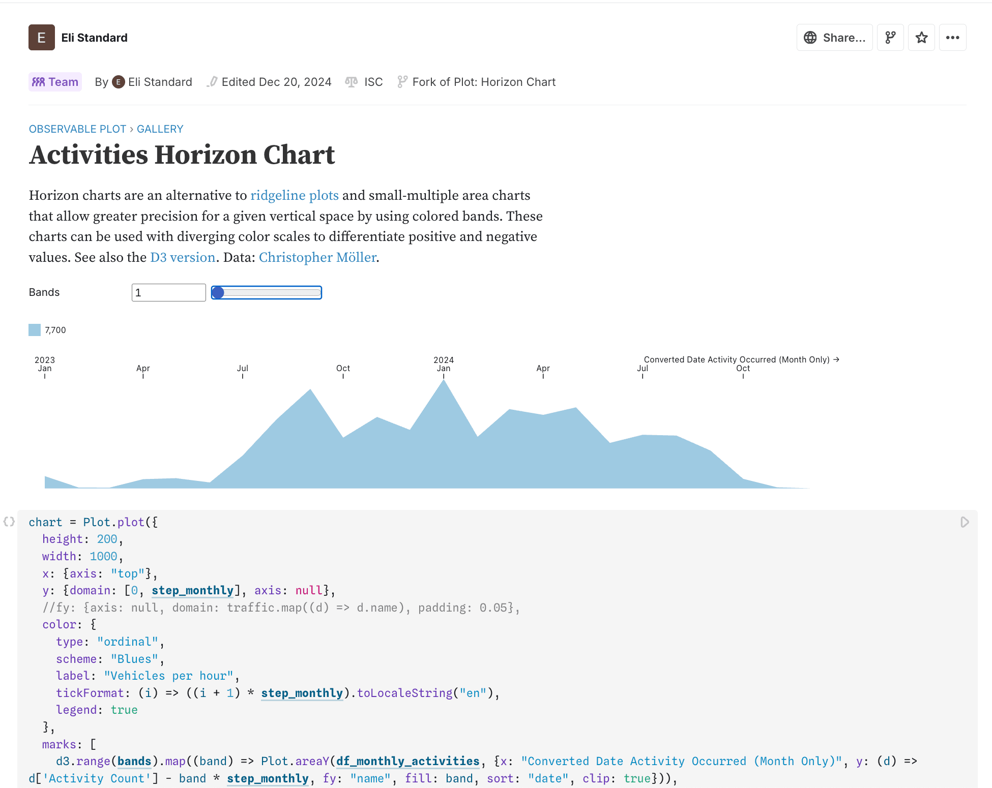
I converted the monthly series into a horizon chart using D3 in Observable.
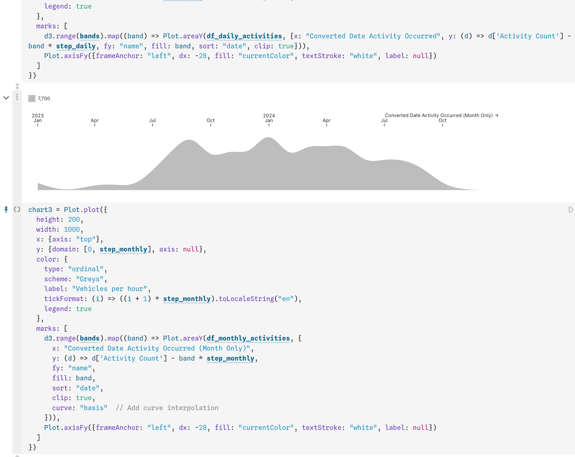
I added curve interpolation so the timeline was more visually appealing at a glance.
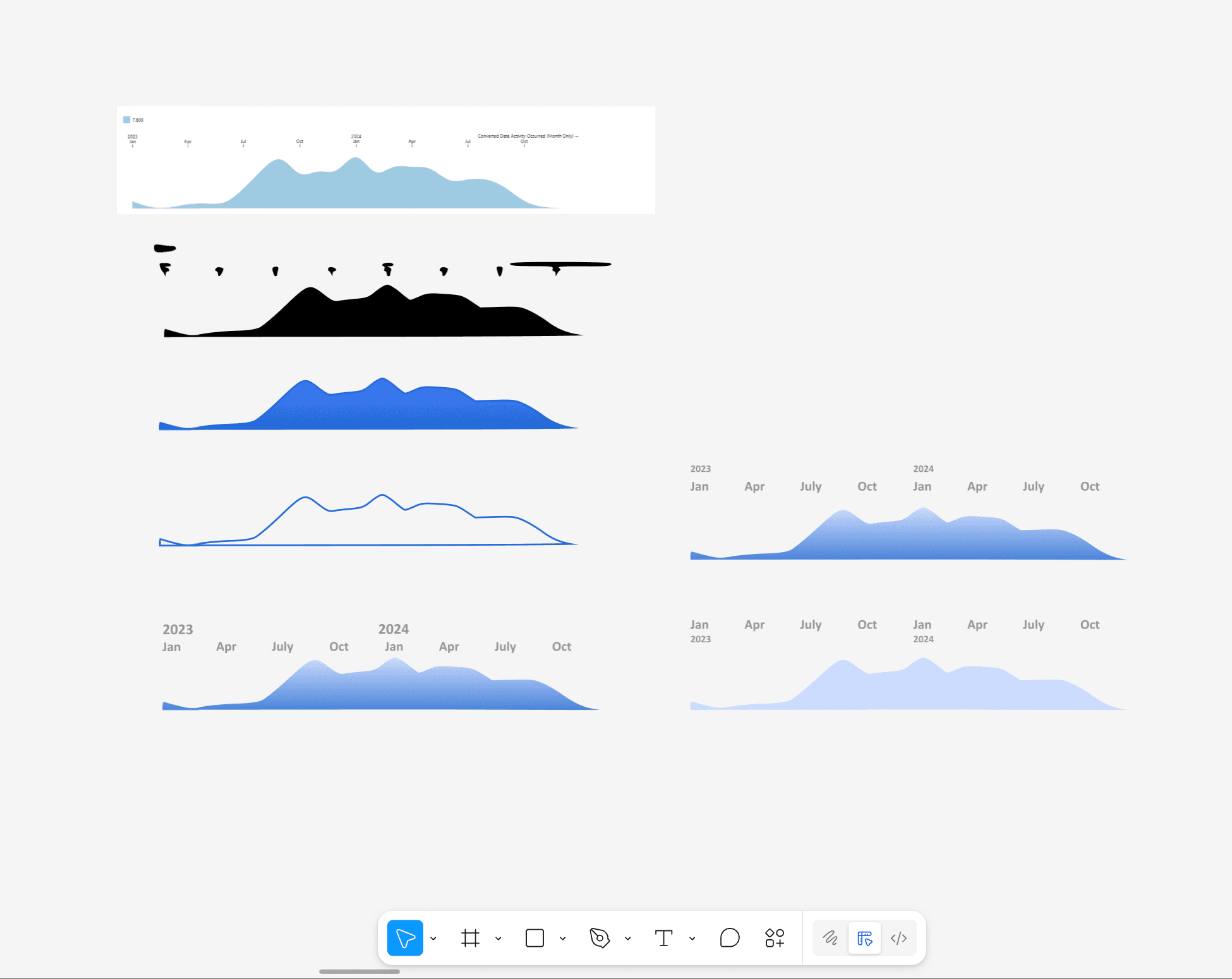
I brought the chart into Figma and tried different visual treatments against the rest of the layout.
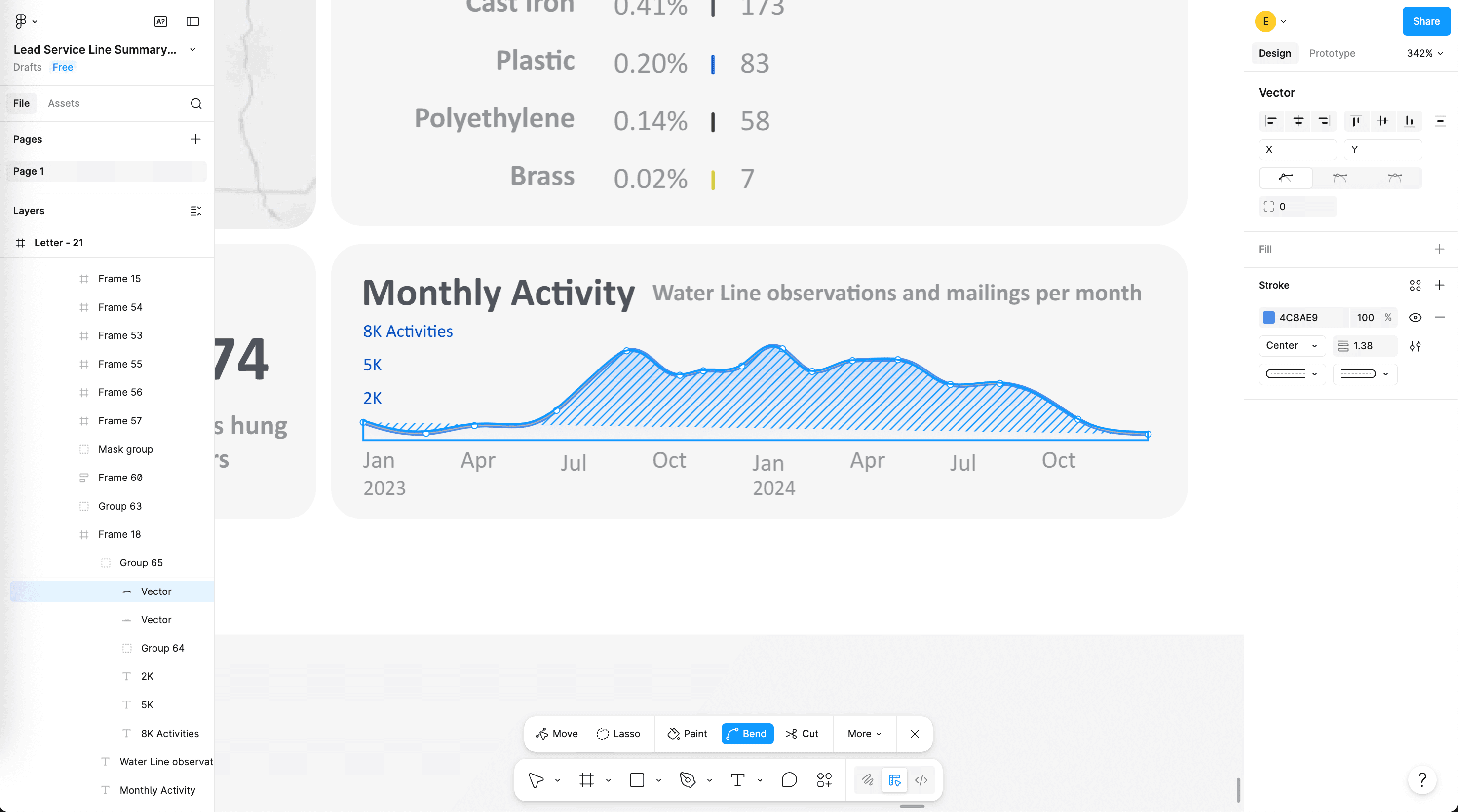
The final horizon chart was manually traced and put at the bottom of the graphic.
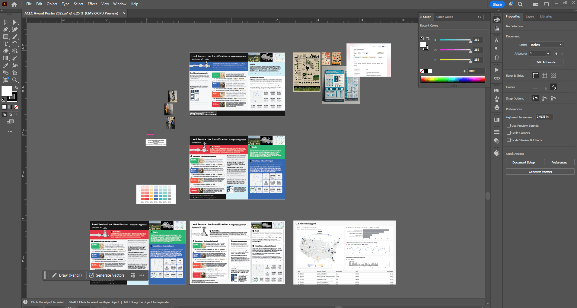
For the ACEC Engineering Excellence submission, I rebuilt and extended the artwork in Adobe Illustrator to fit a taller poster canvas, rescaling charts and illustrations from the one-sheeter while making room for longer narrative copy.
I adjusted section structure, typography, and visual hierarchy so goal, background, problem, solution, results, and future read clearly as you move down the poster.
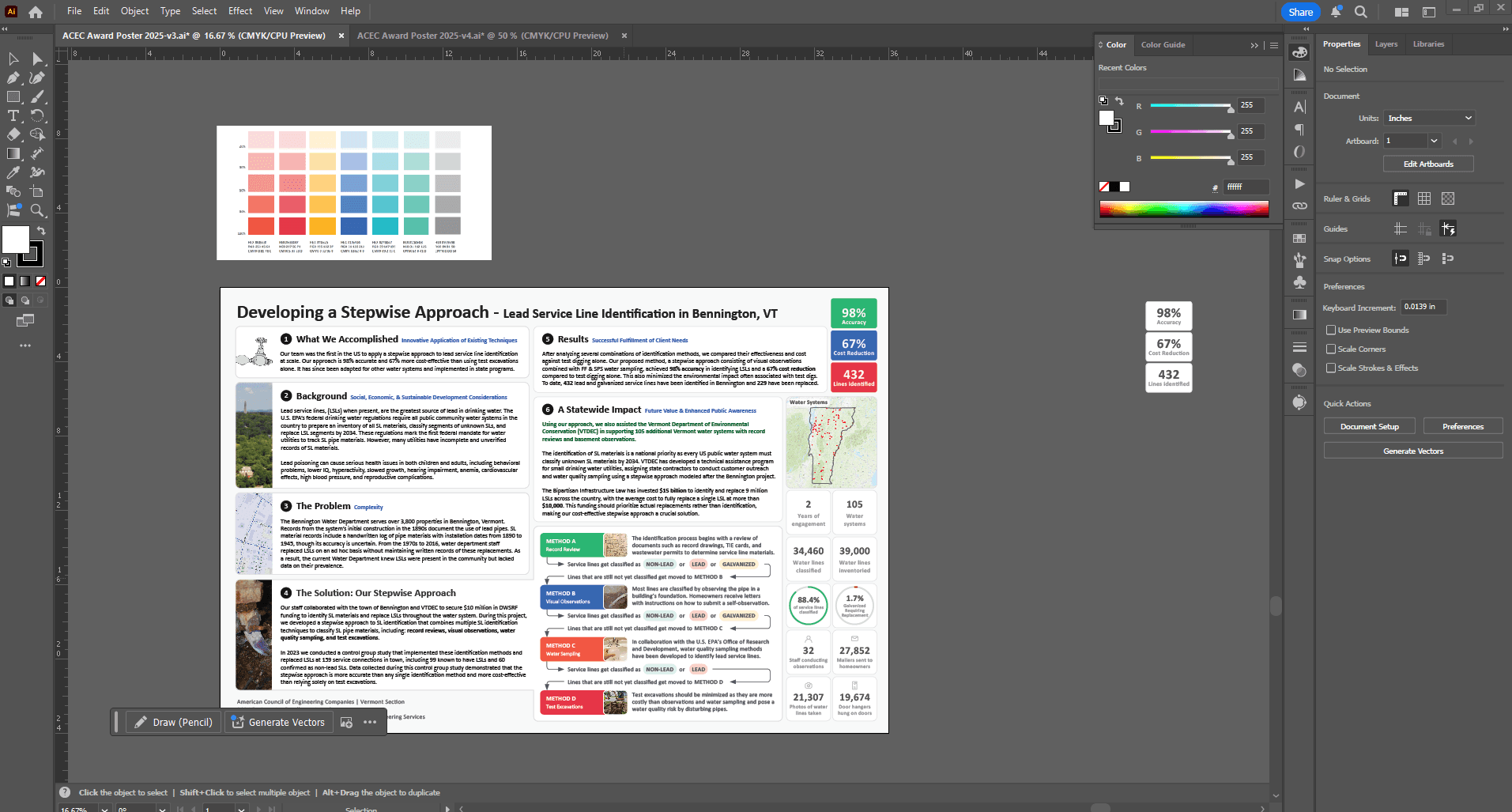
Final rounds focused on alignment, balance between text and data visuals, and print-ready detail before the poster was submitted.
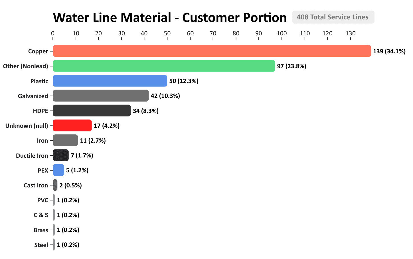
Custom bar charts for engineering reports
A large part of the water service line inventory project was writing reports to summarize the data we collected so water system operators could understand the state of their water system. How many lead pipes were found? How many galvanized iron pipes need to be replaced? How many are copper or HDPE?
To enhance the readability of the report findings, I created a D3 and Observable-based bar chart template in JavaScript that could be used by engineers and technicians to visually summarize how many pipes were found with each type of material. This made reports easier to read and helped visualize data instead of relying on text-only summaries.
See the Observable notebook: Custom Bar Charts for Water Service Line Reports.
How this graphic was made
After engineers completed an inventory for each water system, MSK staff were required to provide a written report summarizing how many service lines fell under each pipe material. I noticed that most engineers were writing these reports in text only. To fix this, I created a custom bar chart that felt much easier to read at a glance.
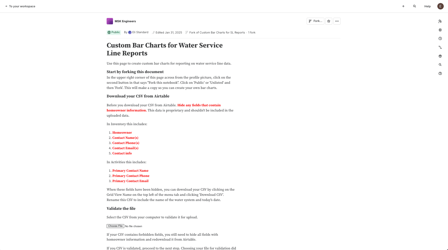
I built a template in Observable with D3 so engineers could upload a CSV of inventory data and have it summarized automatically as a bar chart.
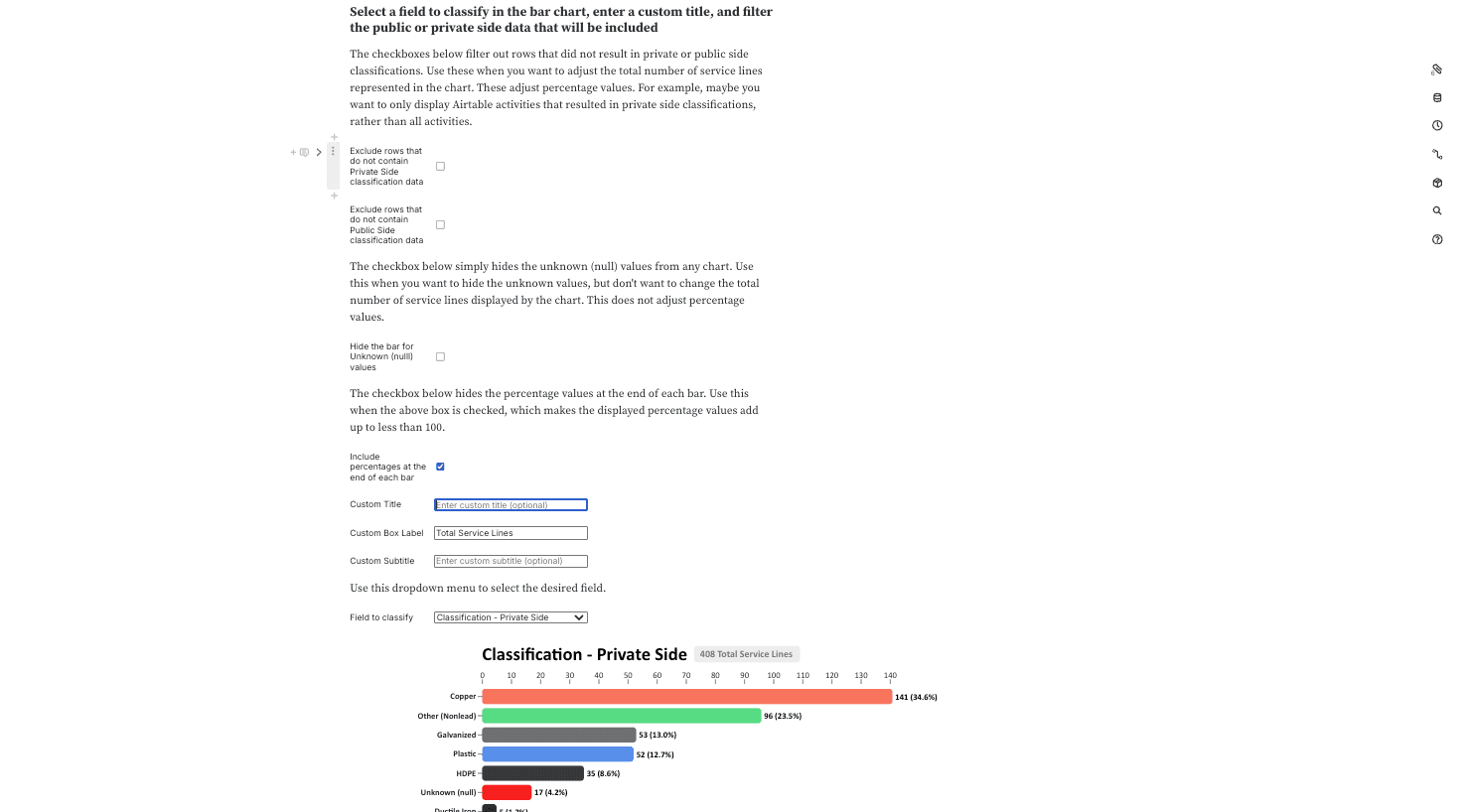
I added controls to filter rows, hide the bar for unknown pipe materials, set a custom chart title, and pick which spreadsheet column is being used to display the counts on the chart.
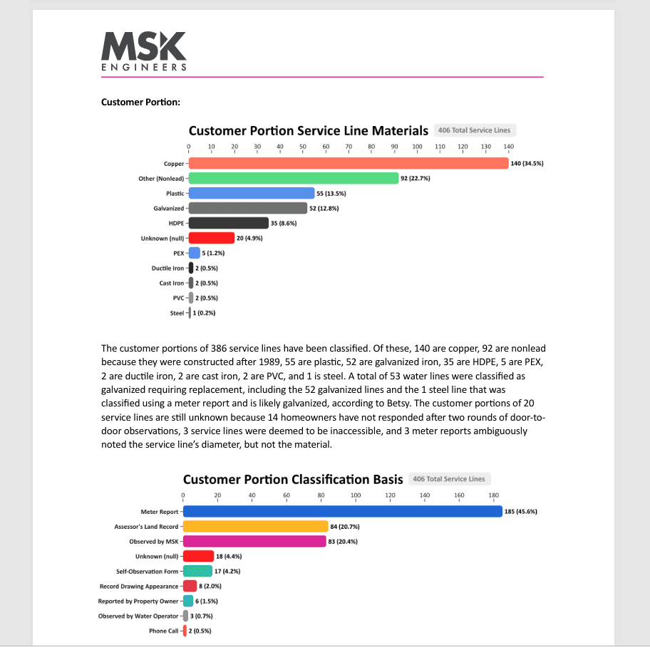
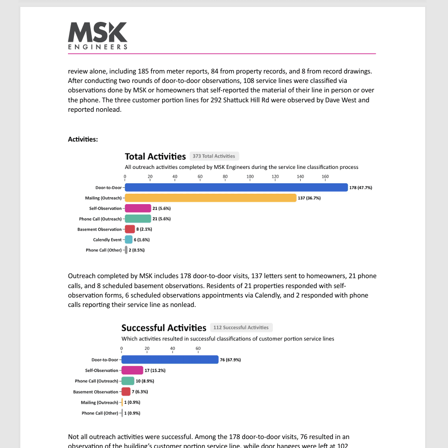
Here is an example report that pairs screenshots from the notebook with the written summary so operators see both narrative context and the visual breakdown.
The same workflow could be used to summarize which field activities were the most useful in classifying the water service line materials.
Stepwise approach one-sheeter
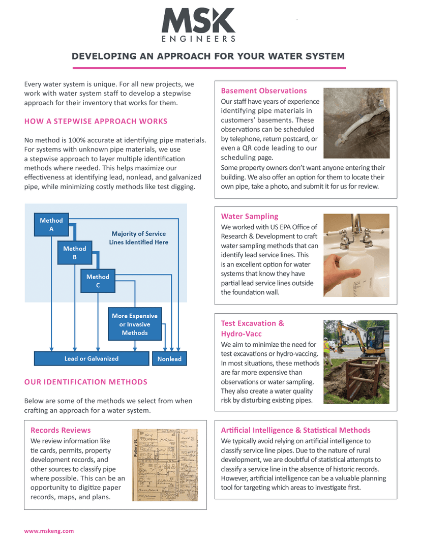
I improved information design in brochures and one-pagers, including this stepwise approach to water service line identification. I reorganized content and applied a clear visual hierarchy so the sequence is easy to follow at a glance.
Previous Design
After
Website redesign
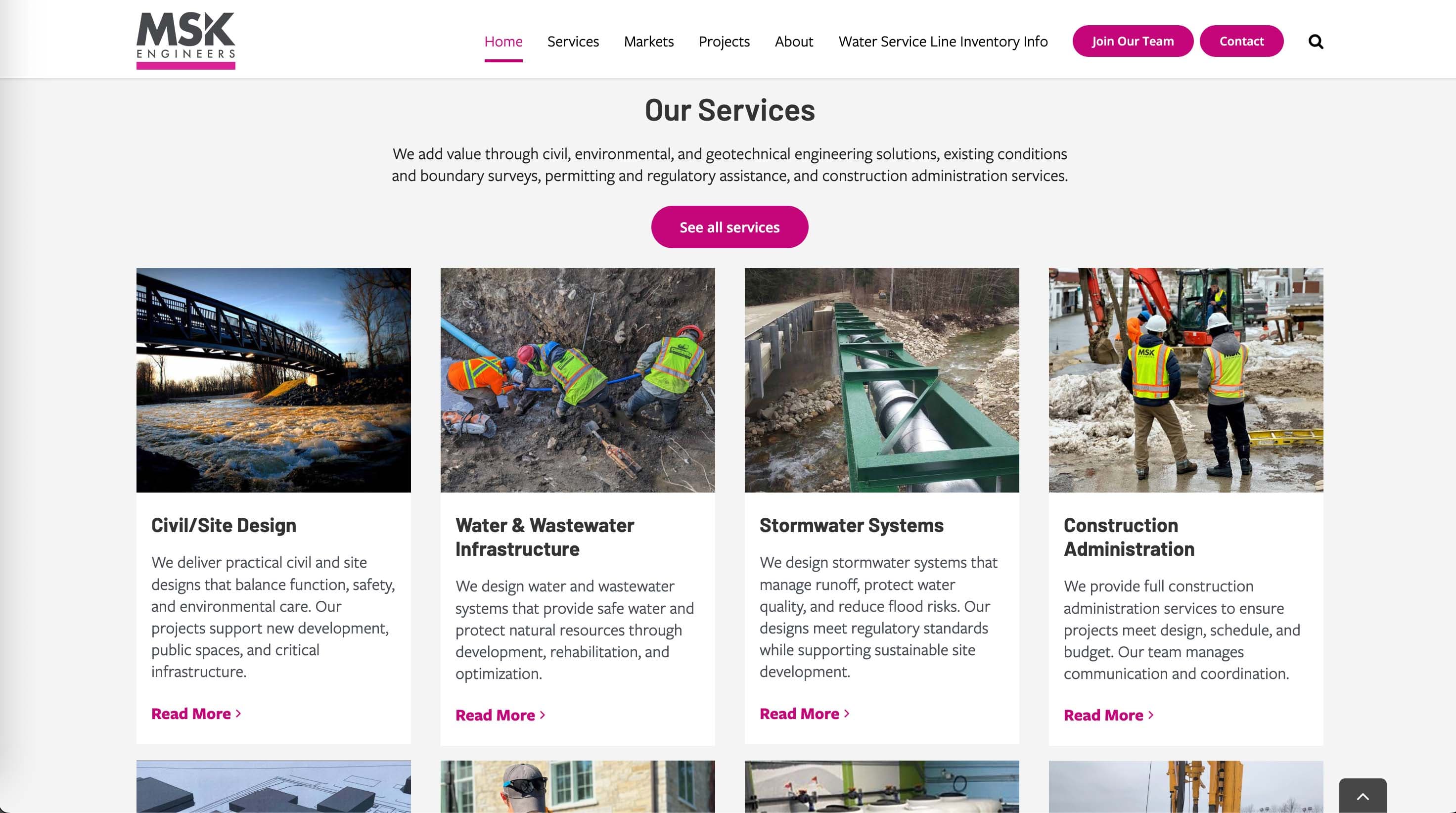
I redesigned the MSK website end to end. The previous site lacked basic wayfinding (no clear list of services) and relied on stock photography. I rebuilt the navigation, page templates, and visual system, and replaced imagery with in-house photos to better represent the team and projects.
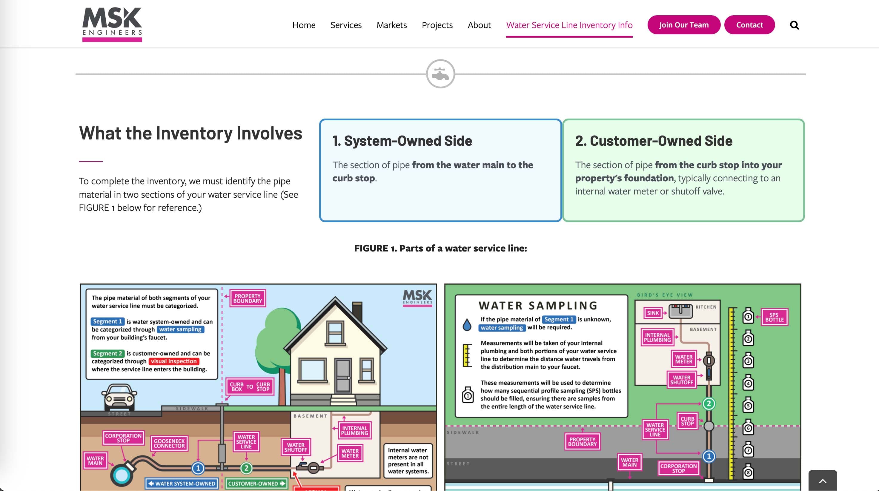
I also created a homeowner resource for the Water Service Line Inventory, with step-by-step instructions and simple visuals that help property owners identify service line materials and comply with new regulations. See the live site and the homeowner page: mskeng.com · Water Service Line Inventory for Property Owners.
Previous Design
After
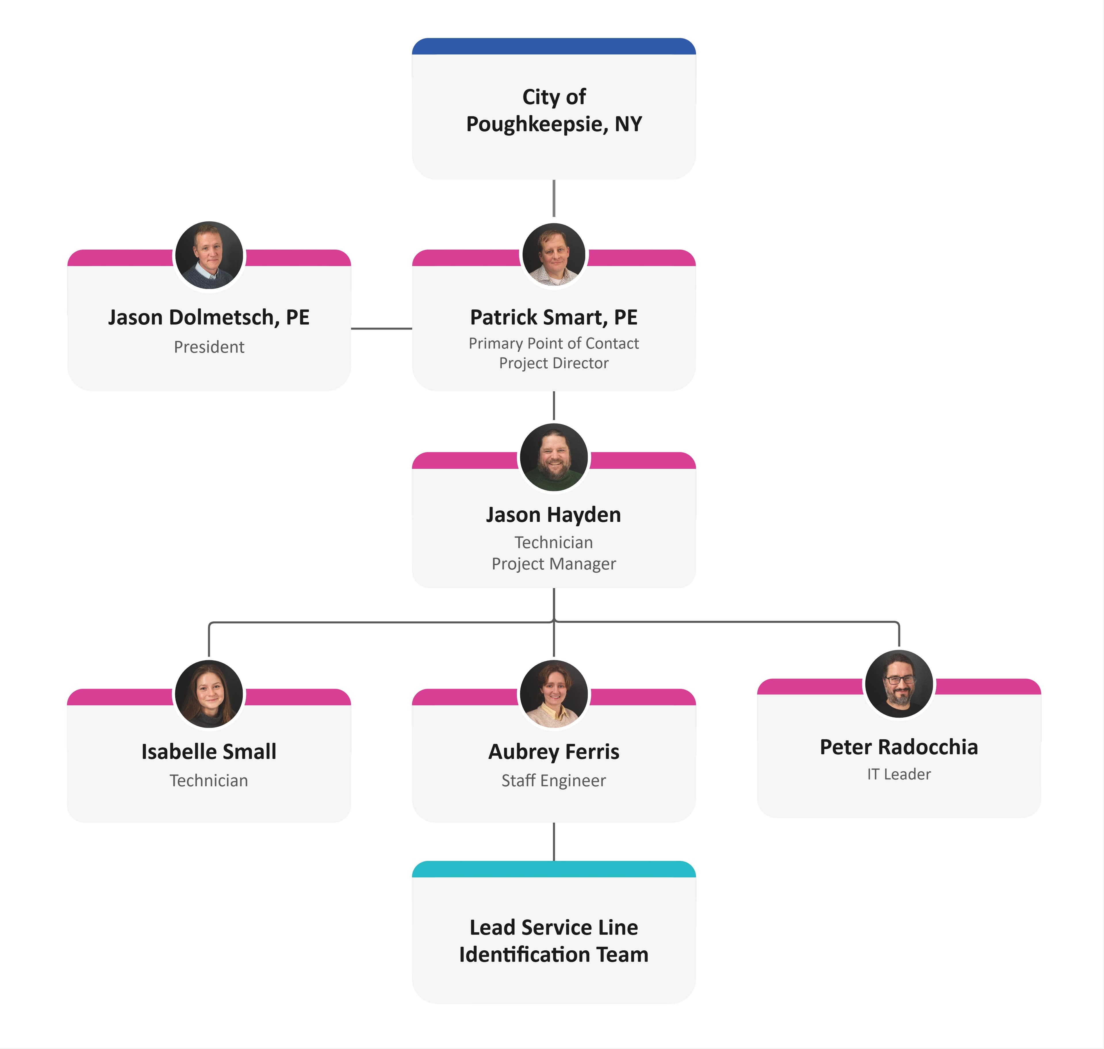
Org chart redesign
I improved proposal visuals, especially org charts, by standardizing hierarchy, labeling, and spacing. The result is a clean, modern layout that is consistent across proposals and faster to scan for reviewers.
Previous Design
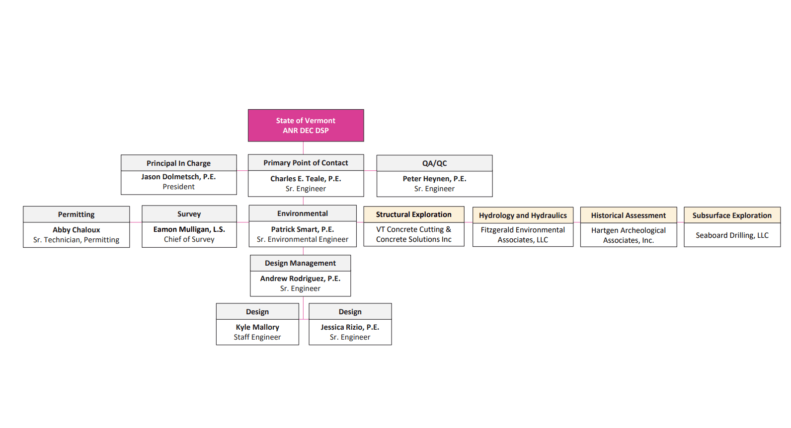
After
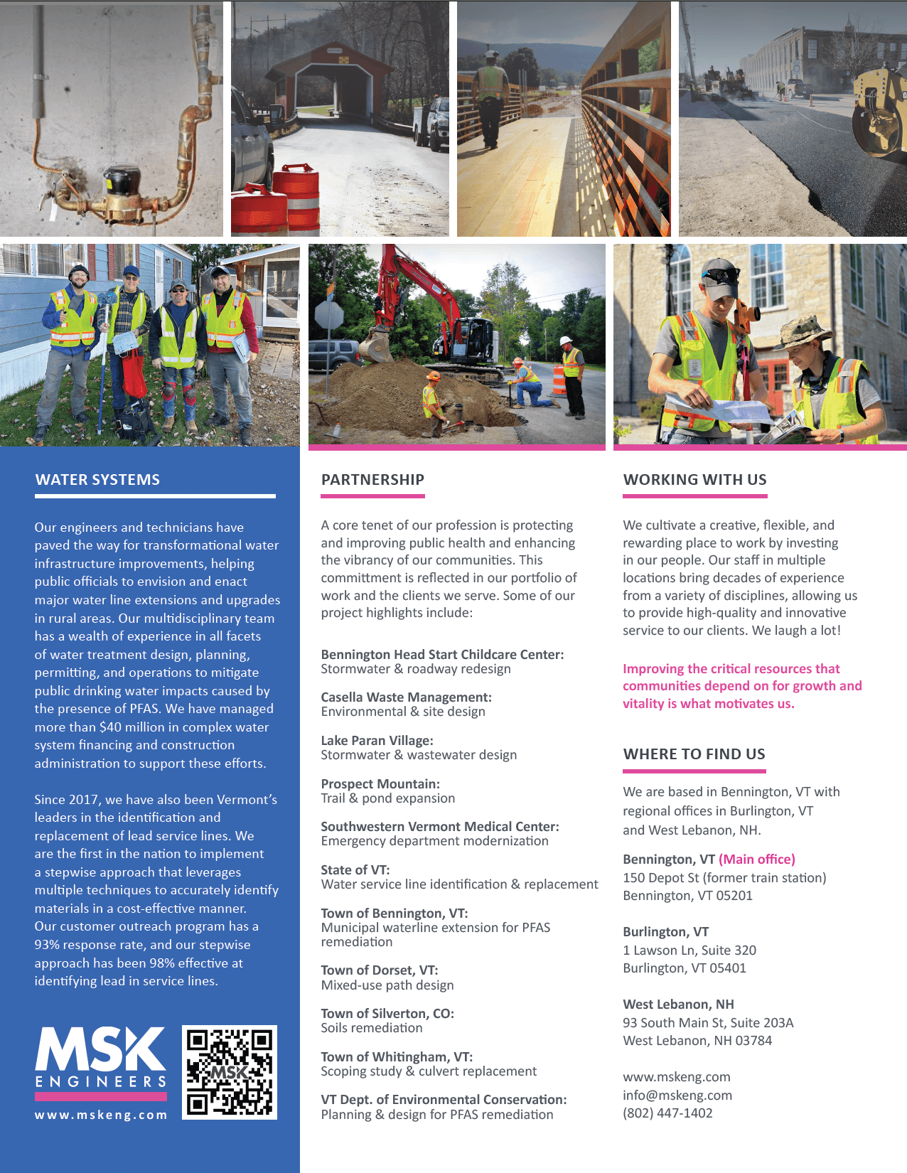
Informational brochure: About us
I refined the About Us one-pager, balancing concise copy with a clear visual hierarchy and whitespace so key facts are easy to find.
Front
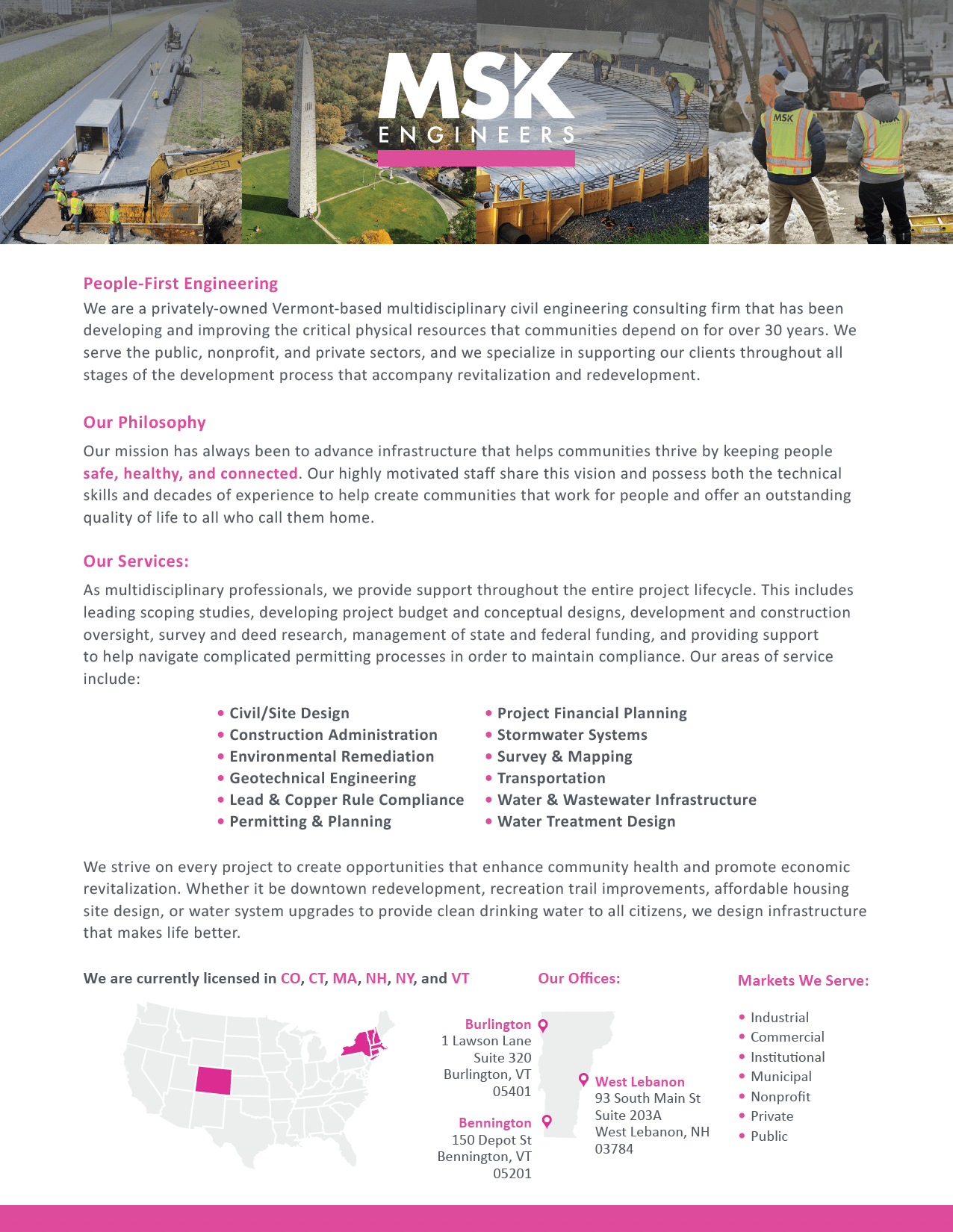
Back
Banner redesign
I designed print marketing materials such as event banners. I tightened typography, contrast, and spacing so messages read clearly at distance and across sizes. The print system now aligns with the updated web styles for a consistent brand.
Previous Design

After

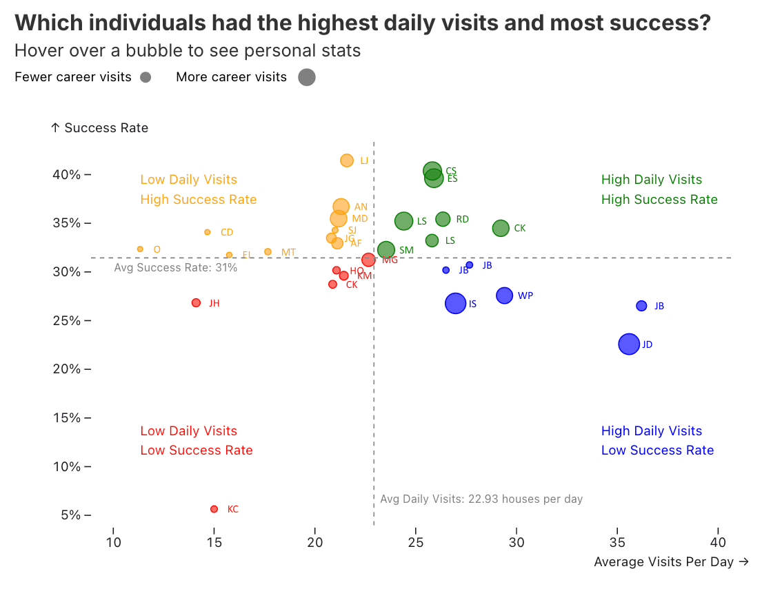
Scatterplot design — Door-to-door water service line visit stats
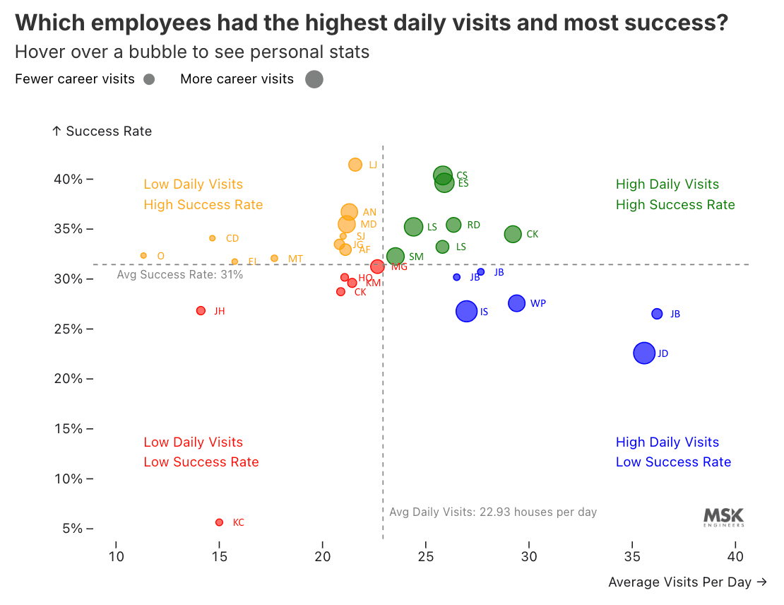
I designed this interactive scatterplot in Observable (D3 + JavaScript) to visualize individual staff performance during MSK's door-to-door water service line inventory outreach. The chart plots each person's average daily visits against their success rate (how often they were able to get into a house and classify a service line's pipe material), with bubble size encoding total career visits. It was built to help project managers quickly identify top performers, spot who needs coaching, and understand the relationship between visit volume and success. The data was aggregated from more than 70,000 field activity records across 30+ staff members.
The step-by-step design process below shows how each iteration layered in new dimensions of understanding.
Design process
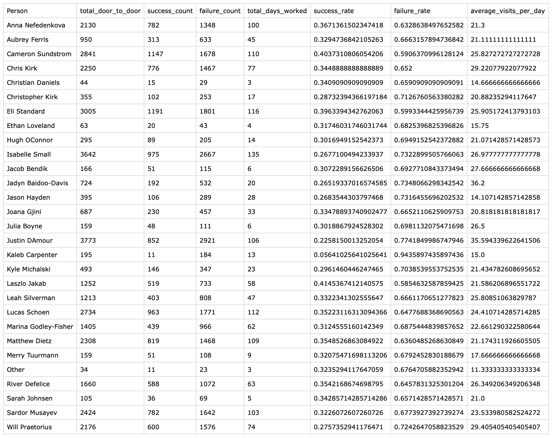
Dataset
I created this source dataset by cleaning thousands of rows of data from our Airtable database, scraping the data from raw field activity records. Each row summarizes one staff member's door-to-door totals including visit counts, successes, failures, days worked, success and failure rates, and average visits per day. This table is the starting point for every visual decision that follows.
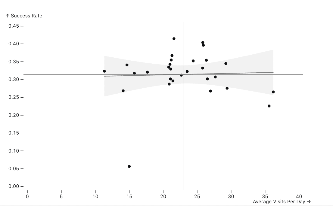
Step 1 — Regression baseline
I started with a basic scatterplot with a linear regression line and confidence band. The y-axis shows Success Rate (how often they got into a house and classified a service line's pipe material) and the x-axis shows Average Visits Per Day (how many doors did they knock on). Both of these metrics are important in understanding individual performance, but the nearly flat regression line shows little overall correlation between speed and success.
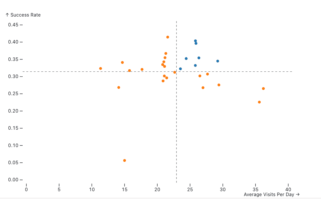
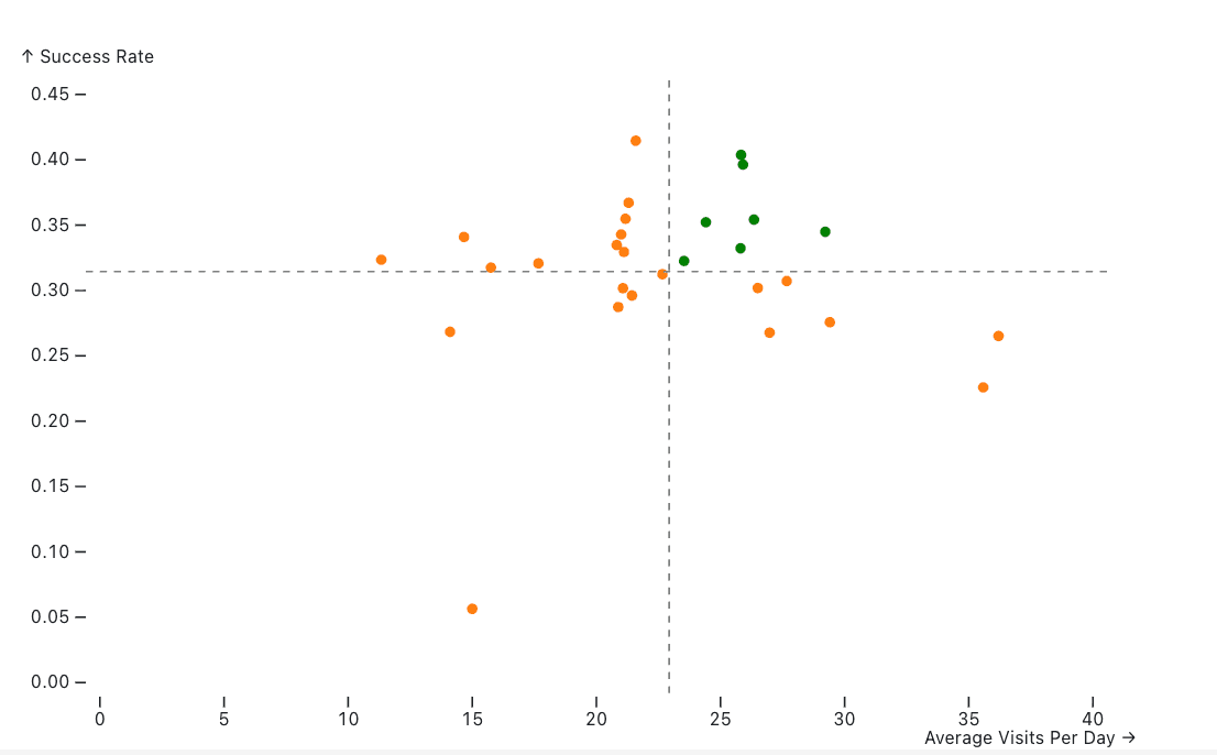
Step 2 — Color by visit volume
I then removed the regression line and introduced color to distinguish staff above the mean daily visits (blue) from those below (orange). The dashed reference lines mark the overall averages, creating four quadrants.
Step 3 — Improved color contrast
Then I made the top performing staff's bubbles green for the above-average visit group. The green-orange pairing reads more intuitively as positive vs. needs work.
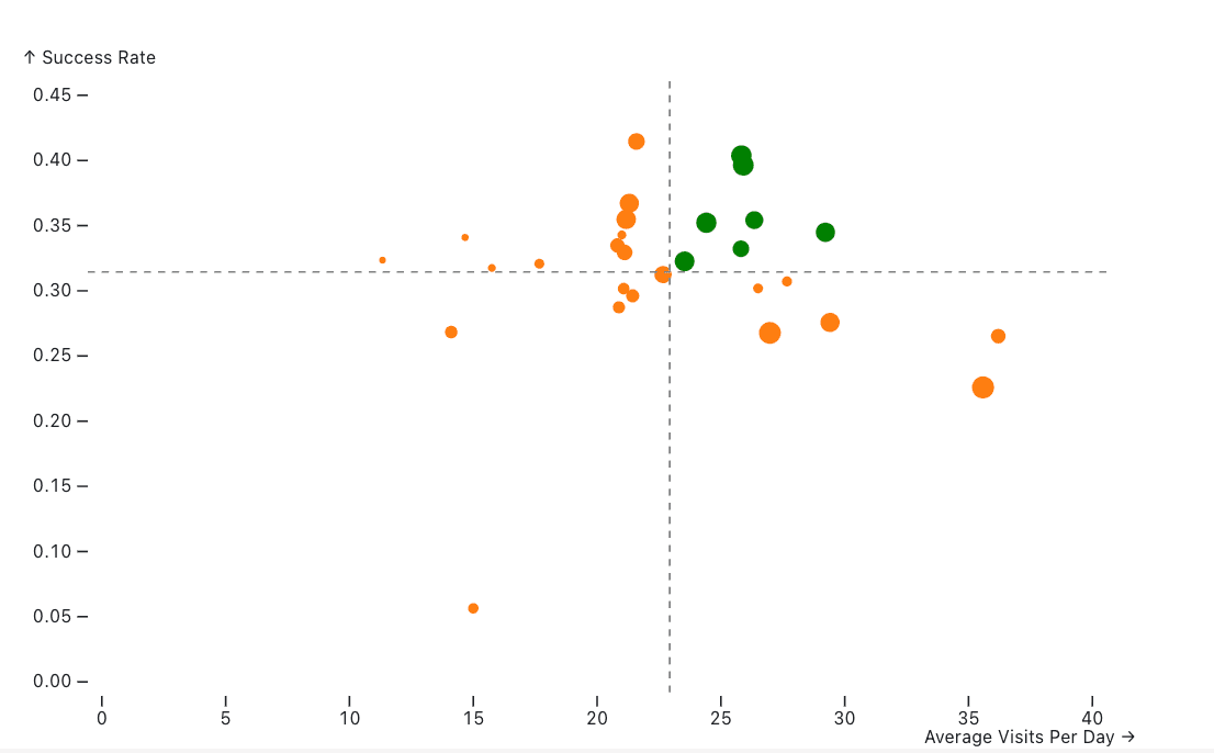
Step 4 — Bubble size encodes experience
I wanted to encode a third variable, total career visits, through bubble size. Larger bubbles indicate more experience on the project, so managers can weigh performance against total career visits when comparing individuals.
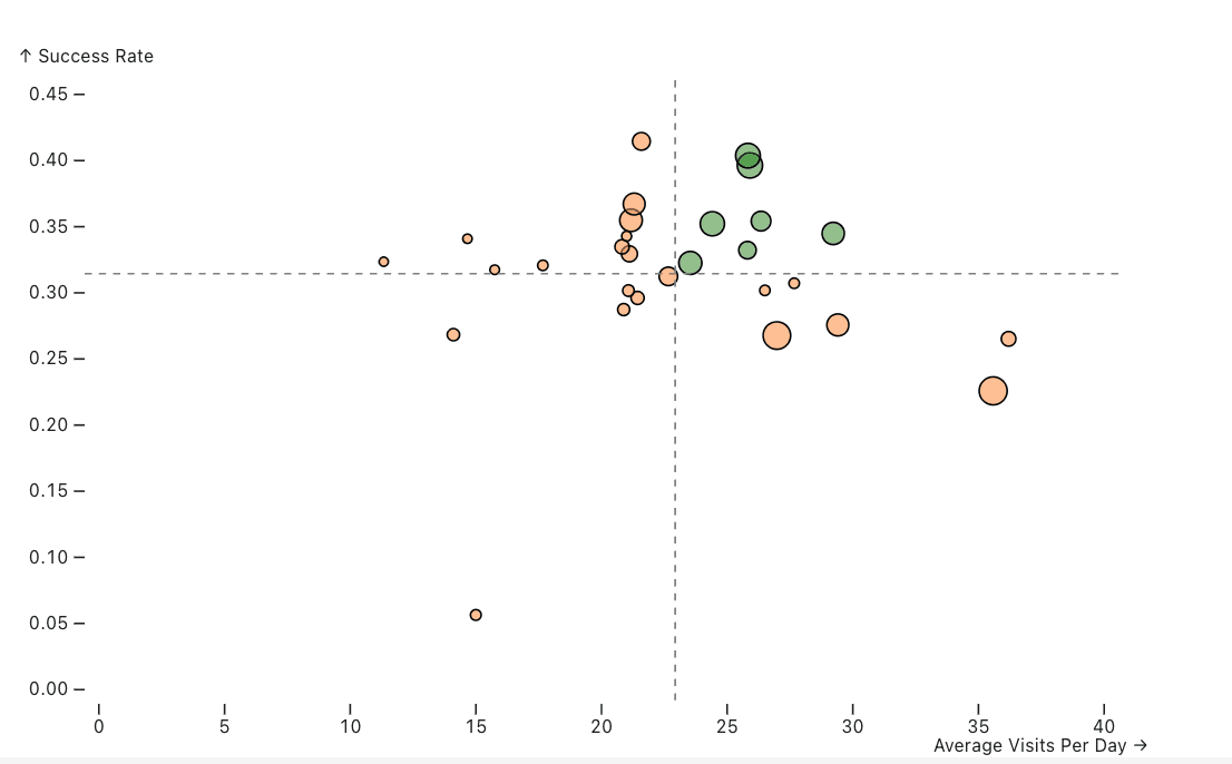
Step 5 — Opacity for emphasis
I then played with varying opacities and how they affect readability.
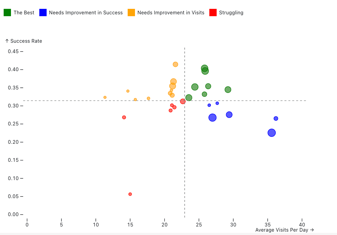
Step 6 — Four-category classification
To distinguish the four quadrants, I made them each a different color and added a legend that showed what each color meant. These included “The Best” (green), “Needs Improvement in Success” (blue), “Needs Improvement in Visits” (orange), and “Struggling” (red). Each quadrant now maps directly to a coaching action.
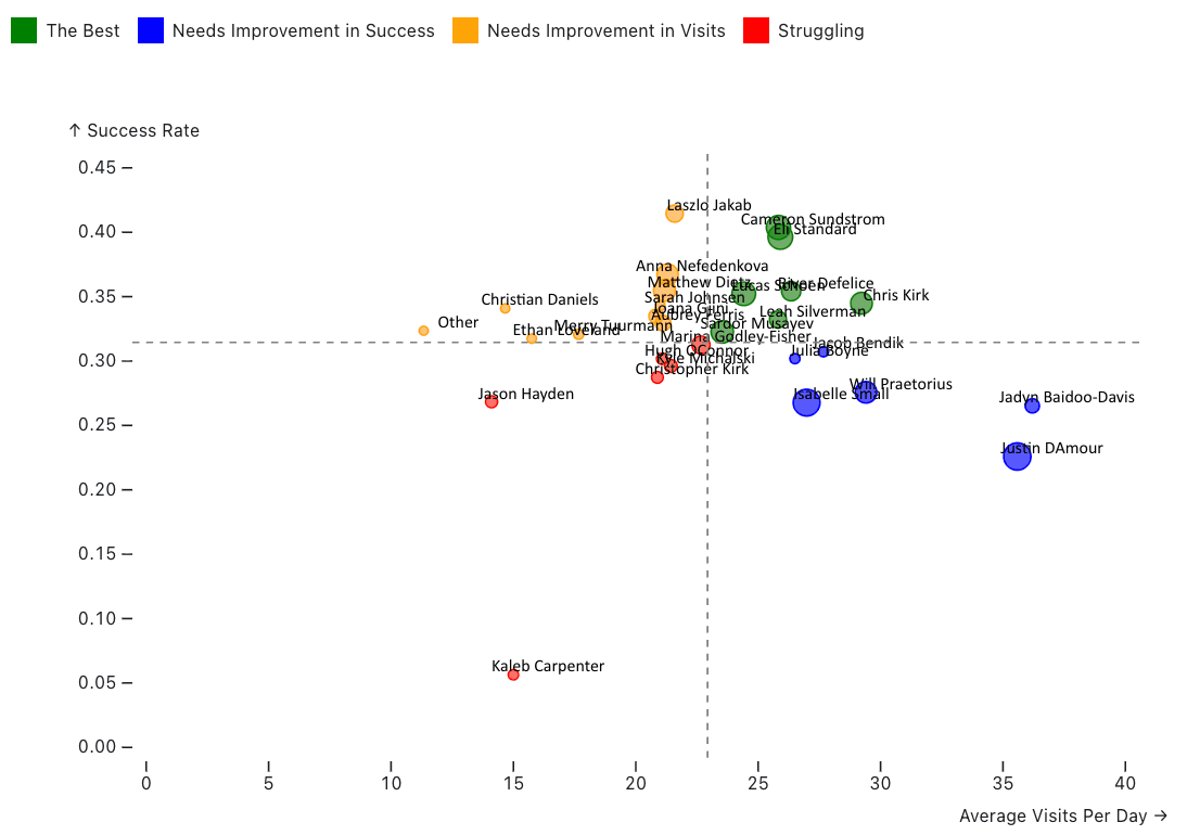
Step 7 — Direct name labels
To emphasize that each bubble is a staff member, I added name labels directly on each bubble so individuals are identifiable at a glance.
Step 8 — Label refinement
I then played with the label coloring, spacing, and origin to reduce overlap and improve legibility.
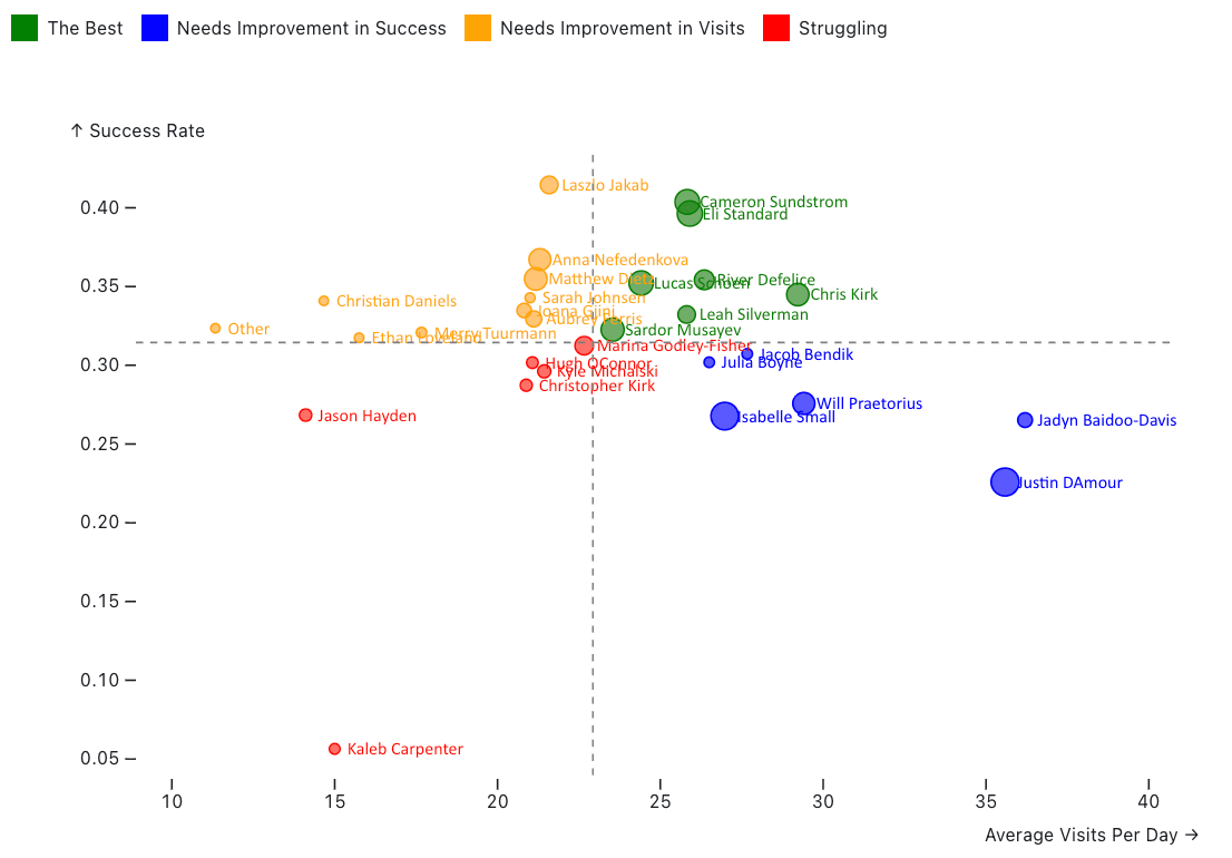
Step 9 — Title, annotations + quadrant labels
I then added a descriptive title, a subtitle prompting hover interaction, a bubble-size legend, and explicit quadrant labels (“High/Low Daily Visits vs. High/Low Success Rate”). I also annotated the average lines with their values and switched full names to initials on the bubble labels to reduce clutter. This allows the chart to stand more on its own without additional explanation or context.
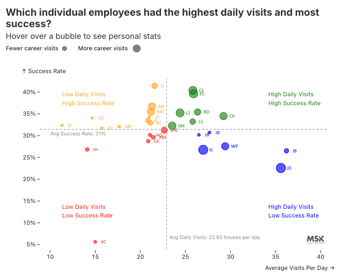
Step 10 — Final polish
Finishing touches included refining the title wording and adding the MSK Engineers logo.
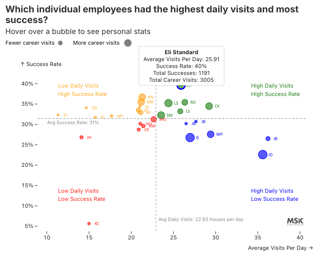
Interactive tooltip
The interactive version on Observable includes a hover tooltip that includes each person's full stats like name, average visits per day, success rate, total successes, and total career visits..